


Discovering a master
Andrew Lambirth
David Milne Watercolours: Painting Towards the Light British Museum, until 25 September The Canadian painter David Milne (1882–1953) is not known in this country. His name is shamefully overlooked by the Yale Dictionary of Art & Artists, and there has never before been a show of his work here. The fact that there is one now is largely due to the vision and enthusiasm of Frances Carey, who acquired three watercolours by Milne while she was deputy keeper of Prints and Drawings at the BM. However, even when there is a really superb exhibition of his work in London, the public is not beating a path to its door. (Would it be different, one wonders, if the show had been mounted elsewhere — at the Royal Academy or the Tate, with their prestigious exhibition halls and effective publicity machines?) Quite frankly, people don’t know what they’re missing. Discovering Milne has enhanced the store of beauty in my mind, and opened for me another chapter in the history of watercolour — a chapter he occupies entirely on his own.
Milne was born in a log cabin in the wilds of Ontario, the tenth child of émigré Scots farmers. A clever child who excelled particularly at botany, he grew up to be a teacher, but wanted to be an artist and took a New York correspondence course in how to paint. In 1903 he went to New York to be an illustrator, enrolled in the Art Students League, and made a precarious living painting window signs for shops. He was inspired by Rockwell Kent and other older contemporaries such as Robert Henri, and tried his hand at pastels and etchings. From 1912, he concentrated on watercolour and oil (he showed two oils and three watercolours in the Armory Show), gradually developing his signature style of watercolour — a highly original treatment of the medium reliant on very little water and application with a hard bristle brush. The exhibition begins with some of his early watercolours, which are more fluid in style than his mature work. A masterpiece of this period is ‘New York Roofs’ (c.1912), notable for the extensive areas of the support (in this case, illustration board) left blank. Milne was adept at letting the white of the paper work for him. He could draw a convincingly solid figure (see the roadsweeper in ‘White Matrix’) with a few coloured lines and an expressively contained shape. But he was equally skilled with black, in a typically anti-Impressionist way, and used it unsparingly. Although his early work is very French in spirit, the use of colour approaches the expressionist. ‘Cobalt Trees’, of probably the following year, is already daring in colour, while his understanding of the structure of trees shows signs of the mastery it would soon encompass. A couple of ink on Japanese paper drawings further demonstrate this structural, almost architectural, interest.
In December 1917, Milne enlisted in the Canadian army to fight rather than to paint for the cause. After some training in Toronto and rounding up deserters in Quebec, he embarked for Europe, only to be quarantined (against the Spanish flu that was devastating an already depleted populace) at Kimmel Park Camp in Wales. He was there when the Armistice was declared. On leave in London towards Christmas 1918, he discovered the Canadian War Records programme established by Lord Beaverbrook. Through the recommendation of P.G. Konody, the Observer’s art critic and the Beaver’s adviser, he became a war artist. (Konody also suggested a London dealer to Milne, but his advice was ignored, effectively depriving us of seeing Milne’s work for nearly a century.) Kimmel Park Camp was his first subject, closely followed by other camps in Yorkshire, Hampshire and Sussex. Of his UK period, the High Street in Ripon is a fine, richly-coloured study (a little like the Camden Town painters), full of movement and his trademark use of black and white. In 1919 he visited France and Belgium, recording the aftermath of the war, the blasted countryside and bomb craters, the massed graves. The experience moved him deeply. These large watercolours are a remarkable, if bleak, achievement. Look at the expanse of ‘Montreal Crater, Vimy Ridge’, big enough in reality to accommodate a church, a couple of figures poised at its lip to add human scale. As he said, ‘the man changes, and with that, the painting’.
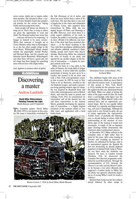
Milne returned to North America and resumed life in the tiny village of Boston Corners in upstate New York. Here he painted some of his finest landscapes, such as ‘Dark Shore Reflected, Bishop’s Pond’ (c.1920). Succinctly structured, fluently composed and ordered, the economy of means echoes the exactness of placing. Milne perfected a highly experimental technique of applying watercolour over his preliminary graphite drawing in dry, discrete touches of opaque pigment like gouache or tempera. Water was sometimes applied last, the reverse of normal watercolour method. It was enormously effective in the depiction of landscape, and particularly of reflections in water. The sparely brushed forms expertly laid out on tex tured paper have an astringency that is curiously sensual.
In a couple of flat cabinets are examples of his coloured drypoint etchings, so similar in appearance to the watercolours, but less radical. There are some nice ripple effects in red, blue and yellow, but the dry brushing of the watercolours is infinitely more exciting. Milne gave up watercolour for 12 years, from 1925 to 1937, and by the time he returned to it, something fundamental had changed. His late work, made with failing eyesight, has none of the intensity or passion of his early landscapes, and tended towards whimsical memory pieces. One here, ‘Snow in Bethlehem’, has a slightly tougher Chagall-like charm, but most of these figure subjects are soft-centred. The exception is a series of four wonderfully loose Turneresque watercolours of a storm over islands, made in 1951, in which he reverses black and white, playing with negative and positive, and painting the lightning dramatically black.
This exhibition, organised by the Art Gallery of Ontario with assistance from the Canadian High Commission, has been designed to raise Milne’s profile abroad. An excellent hardback catalogue has been published to accompany the show (currently selling at the unbeatable price of £14.95), which sets him in perspective and context, and illustrates the work extremely well. The watercolours have been carefully selected (no charmingly faded examples here) and ring true in their pristine blacks, whites and reds. If I have one quibble, it is that the blues suffer, being shown against a backcloth of blue in the display cases. And the blues are one of the marvels (together with the greens and rusty browns) of Milne’s style. I urge you to ascend to the fourth floor of the BM and visit this show. It’s an eye-opener.
The exhibition travels to the Metropolitan Museum of Art in New York (8 November–29 January 2006) and then to the Art Gallery of Ontario, Toronto (25 February–21 May 2006).