


DOWN THE TUBE
Gavin Stamp calls upon
the London Underground to halt its destruction of stations
AN UNDERGROUND railway can be more than a method of moving people about cities, as anyone who has marvelled at the subterranean chandelier-lit marble palaces which serve as stations in Lening-
rad and Moscow will know. This is also true of London, which has the oldest and most complex system in the world. S. E. Rasmussen, the Danish author of London: The Unique City, found in 1934 that, 'it is a pleasure to go down into the stations of the Underground, bright, clean and orderly as they are'. No longer, alas. The excellence of design on the London Underground was once so universally accepted that it seemed rather a bore, especially as partisans of the Modern Movement like Sir Nikolaus Pevs- ner and even Le Corbusier praised its
rather puritanical, utilitarian virtues.
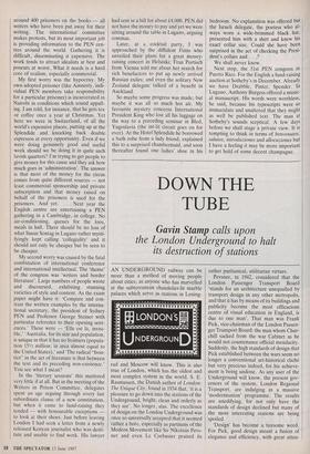
Pevsner, in 1942, considered that the London Passenger Transport Board 'stands for an architecture unequalled by transport design in any other metropolis, and that it has by means of its buildings and publicity become the most efficacious centre of visual education in England, is due to one man'. That man was Frank Pick, vice-chairman of the London Passen- ger Transport Board: the man whom Chur- chill sacked from the war Cabinet as he would not countenance official mendacity. Suddenly, the high standards of design that Pick established between the wars seem no longer a conventional art-historical cliché but very precious indeed, for his achieve- ment is being undone. As any user of the Underground will know, the present gov- ernors of the system, London Regional Transport, are indulging in a massive 'modernisation' programme. The results are unedifying, for not only have the standards of design declined but many of the most interesting stations are being spoiled.
'Design' has become a tiresome word. For Pick, good design meant a fusion of elegance and efficiency, with great atten- tion paid to detail and to durability. Now it seems to be a matter of cosmetics, for much of the money being spent by LRT goes on replacing old tiling, — which often merely needs a good clean — with new finishes which have to have a 'theme'. Sherlock Holmes at Baker Street is one, conveyed with a vulgarity which is more typical of a tourist board than the manage- ment of a public utility. Many of the changes may be necessary. The installation of new ticketing machinery and the provi- sion of mugger-proof ticket offices for staff cannot be criticised. What must be criti- cised is the insensitivity of the new work to the character of the existing stations. A further criticism is that the 'modernising' of platforms is often but a face-lift, a cosmetic treatment which actually narrows already tight tunnels and contributes nothing to the greater efficiency of traffic flow. Frank Pick, it should be noted, left the older stations alone except when making real improvements, such as enlarging the book- ing hall or installing the new escalators.
Many harassed users of the Under- ground, exasperated by the filth, by lifts and escalators not working and by late trains, may feel that the stations are of no interest. In fact, it is the essence of good design that it should be both unobtrusive and yet felicitous when studied closely. Taking pleasure in the detail and variety of treatments to be found on stations is an innocent enough pleasure while an ex- ploration of the system in fact provides both an historical and a visual education. There are the oldest, Victorian stations, then the Edwardian stations designed by Leslie Green, with their characteristic fac- ing of ruby-red tiles and decorative internal file-work tinged with Part nouveau. Above all, there are the stations designed for Pick by Charles Holden, a great architect whose sound, sensible work was tempered by a Classical sensibility.
Few know the whole system and its many delights. As one of the authors of a report on what is happening to London Transport prepared by the Victorian Socie- ty and the Thirties Society, called End of the Line? I had an excuse to explore distant lines — an adventure facilitated by one of LRT's admirable innovations: the One- Day Travelcard (actually introduced by the GLC before 1984). I would strongly re- commend readers interested in 20th- century British architecture to do the same. There are unexpected masterpieces like Gants Hill — Holden's answer to the Moscow Metro — or East Finchley, where a sculpture by Eric Aumonier relieves the austerity of the classic Modem Movement motif of glazed semi-circular staircases.
But above all there are the stations on the outer reaches of the Piccadilly Line and the southern branch of the Northern Line. Between Clapham South and Morden, Holden designed stations which are models of Classic abstraction in which the brilliant use of formal geometry to reconcile diver-
gent axes of street, escalator and track reassures passengers on the journey, through the booking hall and down to the platforms. There is also an exquisite atten- tion to detail: excellent mottled tiling internally (now disfigured by graffiti and inappropriate paint), brass trims to the platform signs and chandeliers in the entrance lobbies. These stations were com- pleted in 1926. When Holden came to design the Piccadilly Line stations four years later, he had been influenced by continental modernism and the stations are
more simple, in brick and reinforced con- crete. Many are conceived as landmarks in dreary suburbs: the illuminated Express- ionist tower at Osterley, the vast rectilinear booking hall at Acton Town or the famous circular drum at Amos Grove. These stations have lasted well, are efficient and, not least, are beautiful. They are amongst the best British buildings of their time. It seems a tragedy that, to judge by many of the alterations being carried out, LRT's architects cannot see their virtues.
LRT's response to criticism is that, first, the public likes what they are doing and, second, that they are not running a museum. Naturally the public, faced with a choice between a squalid, neglected station and a re-vamped one, will prefer the latter, but that is not the point. Nor could anyone who bothers to read the detailed sugges- tions made in End of the Line? accuse the authors of wishing to impede technical improvements, for these — when they really are improvements — need not spoil good architecture. Unfortunately, while a fortune is being spent on meretricious new tiling, many of the new lifts and escalators seem to break down.
A case in point is Russell Square, the Spectator's local station. After years of tiresome building work, three new lifts have been installed. Usually only one is working, sometimes none, forcing passen- gers to walk up the deepest staircase in central London. Meanwhile, all the fine green tiling in the booking hall has been smashed and replaced when new ticket windows could have been designed in an appropriate style and colour. Now one fears for Leslie Green's simple and charm- ing decorative tiling on the platforms, for on so many other central stations on the Piccadilly, Bakerloo and Northern Lines, this has been covered over by new tiling of markedly inferior quality as well as design. The trouble seems to be that too much is being done too quickly — often by sub- contractors — with insufficient overall control. But LRT also seems to be afflicted with that obsession with fashion and image which, as with British Telecom, has re- placed more careful and civilised approaches to design. It is rather depress- ing that, with both organisations, listed building legislation has to be invoked to protect what should not need protecting. With London Transport, it is vital to appreciate that a new 'corporate image' is simply not necessary as one was imposed by Frank Pick over 70 years ago — when the London Electric Railways Co. was a private concern. Unity throughout the system was achieved by the 'bull's eye symbol and, above all, by the use of the beautiful sans-serif lettering commissioned from Edward Johnston in 1915.
Notwithstanding fashion, this lettering has not dated. It is of a timeless excellence because it was ultimately based on the proportions of the Roman lettering on Trajan's Column. It is therefore alarming to find that not only is LRT replacing old station signs by new, less well shaped' and less sensitively sited ones, but that it is even contemplating fiddling with this de- servedly famous lettering and using much more lower-case, so giving London Trans- port the banal character of any airport or hospital. This is as irresponsible as it is ignorant.
As it is his centenary year, it is worth quoting Le Corbusier's comments on Lon- don Transport, made in 1936.
The buses are splendid — red, covered with beautiful lettering; tall, strategic towers. The layout of the London tube impresses me by its size, its pleasantness and the comfort put at the passengers' disposal, and by the care the public takes of the accommodation it has been given.
What has changed since is that part of the public no longer cares, so that even outer suburban stations are now afflicted with a rash of loathsome New York style graffitti. This, however, is no excuse for London Regional Transport to spoil these buildings further with ill considered and poorly executed alterations.
Frank Pick ran an efficient commercial organisation but he believed that his re- sponsibility also lay in not pandering to but educating the public. To anyone with an eye, his achievement in London Transport was one of the best things the English have ever done in architecture and design.
It is not being nostalgic to wish to protect Pick's work, for it is a rare and satisfying pleasure to find visual excellence in a public utility. The Viennese have recently restored the Stadtbahn stations designed by Otto Wagner — without impeding the trains; the Parisians now look after the Metro stations by Guimard. I wish there was more evidence that London Regional Transport is aware of its wider responsibili- ties.