
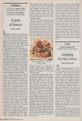


Crafts
Designer Bookbinders 1987 (Leighton House, till 28 November)
Judging by the cover
Tanya Harrod
The essence and purpose of book- binding is, first and foremost, to protect the book, and in such a way that it can be read easily.' Firm words from Sydney Cockerell who died last week and whose beautiful bindings embellished with cal- ligraphy by Joan Tebbutt from the Keatley Trust collection are currently on show at Leighton House (12 Holland Park Road, W14), together with new work by fellows and licentiates of Designer Bookbinders.
This impressive exhibition has its de- lights and frustrations. The books are displayed so as only to reveal the binding and end papers: it is apparently impossible to combine this with a glimpse of the paper and print of the text. Ideally, of course, a binding should complement the text and in many instances it is possible to guess that this has been achieved — as with Jen Lindsay's lovely dark blue Iliad with its sculpted hint of armour and splash of bloody red or with Trevor Jones's elegiac binding for the Officina Bodoni edition of Joyce's The Dead.
Nowadays finding books worthy of bra- vura binding presents serious problems and in the case of uncommissioned work can involve the binder in a daunting initial outlay. The ideal, of course, would be a consistent collaboration between a private press and a binder: this seemed to be a common arrangement when the private press movement was at its height at the turn of the century. Then craftsmen like Ashbee and Gill wanted to print beautiful books which were also heartfelt artistic statements. Such unities — a vivid, impor- tant new text, fine printing and binding are rare today. There are very few books at Leighton House which one would pas- sionately wish to read: the binding is the main reason for our interest.
Failing a richness of material and an active spirit of collaboration between all parties — of the sort which led David Jones to thank the printer of his autobiographical In Parenthesis in a postscript — bookbind- ers are naturally bound to move in a highly individualistic direction; just like contem- porary jewellers, textile artists and potters who are similarly deprived of a clear-cut place in our art life. Dee Odell-Foster's Lhasa 1 is a beautiful, affecting work of this innovative sort. Based on the format of Tibetan holy books, blank pages are laid between two pieces of yew — the upper piece twisted and mountainous and flutter- ing with red pennants to commemorate that secret land and its invasion. But adventurousness and taste do not always go hand in hand. Philip Smith's prayer book in which a pair of leather-bound hands form part of the cover seemed a straightforward piece of kitsch. Gruesome beauty is clearly a rich area for the designer bookbinder, and the writings of Georges Bataille and Pauline Reage would be ideal texts for some of the puckered, distressed and torn bindings on display here.
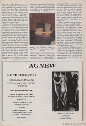
Binding by Jeff Clements for NdA Press: in goatskin with goatskin inlays and blind tooling But the ingenue is always a conservative. With Sydney Cockerell as a starting point, I was more drawn to Denise Lubett's Italianate designs, to Jeff Clements, a bookbinding William Scott or Ben Nichol- son, and to the unexpected beauties of the deliberately impoverished surfaces created by John Pearson and by Romilly Saumarez-Smith. Time and experience would probably bring me round to Jenni Grey's reworking of Philip Larkin's paper- back Required Writing in which each sec- tion is enclosed in acetate supported by a brass rod and the whole housed in a perspex box.
Actually, Required Writing contains a pertinent little essay entitled 'Books'. 'I should never call myself a book lover; it all depends on what's inside them,' Larkin wrote discouragingly. But he went on to recall a memorable scene from Orwell's 1984 in which Winston Smith finds 'a peculiarly beautiful book' in a junk shop. The binding and paper were superb. The pages, however, were blank. What Larkin identified as an inspirational image for the writer might also appeal to the modern bookbinder, caught between honouring and ignoring the text, between protecting the book and making art.
Not to be missed in this Bernard Leach's centenary year is The Leach Tradition: A Creative Force, an exhibition at the Crafts- men Potters Shop, 7 Marshall Street, London Wl, from 17 to 28 November, with work by members of the Leach family and younger followers like Jim Malone and Takesi Yasuda.