


A talent lost to war
Andrew Lambirth
Eric Ravilious: Imagined Realities Imperial War Museum, until 25 January 2004
The tragically short career of Eric Ravilious (1903-42) inevitably poses the question, what might he have achieved had he lived longer? He was so talented as a watercolour painter, primarily of landscape and interiors, and as a designer (mostly for Wedgwood), and latterly as a war artist, that he might have gone on to fine things indeed. Would he have turned out to be the greatest of the 'men of 1903', celebrated in an ancillary exhibition at the Museum? His exact contemporaries include Sutherland, Piper, Ceri Richards, Edward Bawden and Richard Eurich. Would Ravilious have surpassed all of these highly talented artists? Of course, it's impossible to know, but on the strength of this exhibition there are signs that he might have taken watercolour even further down the path of innovation he was already treading.
The current show is the largest ever
assembly of Ravilious's work, and the Imperial War Museum must be congratulated for putting it on. My Spectator colleague Dr Alan Powers, a leading scholar in this field, has curated the exhibition and written a fascinating essay for the handsome catalogue which accompanies it. There are over 100 watercolours on display, not to mention ceramics, glassware, furniture, woodcuts, book illustrations and mural designs. The exhibits are divided between two galleries on the second floor of the museum, one of which is principally devoted to the mural designs Ravilious made for three locations. The murals were all carried out, but sadly all have now perished, the most famous, those for Morley College in south London, being destroyed by bombs in the war. An impression of what the murals were like can be gleaned from a slideshow of installation shots, and from preparatory drawings. But what a pity that none of the murals survives.
The main gallery has been subdivided into a sequence of discrete rooms, adjacent cells with a slanting sightline of narrow vertical apertures linking them. It is an ingenious design to enable a large number of works to be shown, by creating lots more wall space. The trouble is that the cells' walls have been painted different pastel tints, and this has an unfortunate effect on the pictures. Coloured walls dim the paintings down, while white walls enhance them. This is particularly evident from the long run of splendid landscapes which stretches from 'The Cerne Abbas Giant' to 'Cuckmere Haven' on the gallery's principal white wall. They look better than anything in the rest of the exhi
bition, and brilliantly illustrate Ravilious's development.
Take an early work, 'Wannock Dew Pond' of 1923. It's a student piece, quite dark and influenced by Paul Nash (who did in fact teach him), but bursting with intent. Compare it to 'Fide Beacon, Sussex', of just four years later, which is more mature, and typically filled with light. Ravilious became a master watercolourist, perfecting a dry technique with much scratching out and cross-hatching, and careful use of the white of the paper. The style is robustly linear. He could design a painting better than most, for it was design that he had studied at the Royal College of Art, and design that he continued to practise alongside his painting. It was Ravilious who came up with the abstract devices for the dustjackets of Everyman's Library, and it was his wood engraving of top-hatted Victorian cricketers that adorned the cover of Wisden until this year. In 1935 he first began to design for ceramics, producing in 1937 the famous Wedgwood Alphabet nurseryware. On the mug, for instance, every letter has an appropriate vignette — A is for aeroplane, B is for bird, and so on. Like the majority of Ravilious's designs, it is dynamic, original and satisfying.
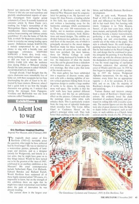
Various themes and interests emerge from a study of Ravilious's limpid watercolours. He evidently loved the chalk downland of southern England, and portrayed its rolling hills with evocative economy. The ancient figures cut into the chalk were also of great interest to him. He liked to depict forms of transport, such as railways, or such oddities as a Church Army caravan and the wreck of a No. 29 bus sup ported on barrels. These interests come together in a famous image entitled 'Train Landscape' of 1939, in which the Westbury Horse is glimpsed through the windows of a third-class railway carriage. (In fact, the picture had originally featured the Wilmington Giant, but Ravilious was dissatisfied with this and collaged this new image over the top.) He was attracted by farm machinery, and liked the contrast of manmade object with elemental landscape.
Another subject was the interiors of hothouses. Three of these images are hung together to considerable effect, 'Cucumber House', 'The Carnation House' and 'The Greenhouse: Cyclamen and Tomatoes', all dappled light and graphic order. Bedrooms and bedsteads were another favourite motif. Curiously enough his war subjects do not appeal in the same way, perhaps simply because they have the same detachment as his civilian ones, in which human presence is minimised.
Ravilious never attempted to engage with the pity or horror of war, he was more interested in the abstract play of shapes it offered him — like a ship's screw becalmed in a landscape. But technically he was loosening up, the brushstrokes becoming more fluid — look at 'Garden Flowers on a Cottage Table' of 1941 — and two of the war pictures, both dark paintings, 'Norway' and 'HMS Ark Royal in Action', are not only beautiful but seem to engender a greater emotional response in the viewer. Undoubtedly, Ravilious was at the top of his form and moving on to greater things when the air-sea rescue mission he joined over Iceland failed to return.