


Icons of the magazine kiosk
Bevis Hillier
FRONT PAGE: COVERS OF THE TWENTIETH CENTURY by Stephane Duperray and Raphaele Vidaling Weidenfeld, .t20, pp. 192 ISBN 0297829718 The last review I wrote for this magazine was of The Oxford Book of Catchphrases. I moaned that, grotesquely, there was nothing by Kenneth Williams; indeed, nothing at all from Hancock's Half Hour. Explanation: an American editor who had only lived in England for about ten years. And now we have here a book on magazine covers — an alluring, juicy subject — but it does not mention Private Eye, still less reproduce any of its covers with voice-balloon captions.
You will never, perhaps, find me volunteering to be secretary of the Richard lngrams Fan Club; but I must concede that he edited a very funny magazine, roughly even-handed in satirising the Left and the Right, and that there were hardly any dud covers (but, I gather, quite a few Pete ones). I'll add — risking investiture with the OBN — that Private Eve is still funny. So why is it left out? The book's jacket coyly gives us nil information about the writers / compilers; but their names — Stephane Duperray and Raphaele Vidaling, with the collaboration of Cecile Amara, Agnieszka Pies and Alain-Xavier Wurst — do not suggest a clique from Reigate or Tunbridge Wells. One does not want to seem xenophobic (one isn't), and obviously a cosmopolitan mix of editors should by rights give us a generously world-embracing selection; but (gulp!) no Private Eve! I ask you! Other rather flabbergasting omissions are Fleur Cowles's Flair and that adventurous, Zeitgeist-capturing 1960s magazine Nova, both of which went in for particularly boggle-worthy covers.
If you are prepared to leap over these chasms, the book has a lot to offer. It is designed (by whom, we should be told) with great panache. It is in full colour — no penny-pinching false economies a bargain at 120. Many ravishing designs are illustrated. Like posters, magazine covers arc ephemeral and serve as a kind of popular art gallery, mirroring social trends unrepresented either in salon art or in Turner Prize freaks.
The material is intelligently organised into two sections: a history of magazines, followed by a set of recurring themes, including people who have set records for the most appearances on covers. I have lived through some of the history: I can remember Punch when it still had the same cover every week, the old Mr-Punchand-Toby one designed by Dicky Doyle in 1849. (It survived until 1956, which was also the last year of the farthings we sang about in 'Oranges and Lemons'.) And in 1962, applying for a job on the Illustrated London News, I was interviewed by its editor, Sir Bruce Ingram, a grandson of the Herbert Ingram who had founded the magazine in 1842. Bruce Ingram himself had been editor since Queen Victoria's reign — 1901. When (aged 22) I said, 'Good morning, sir', he replied, 'Good morning, sir' — which struck me as Dickensian. He chided me: 'Mr Hillier, if you want to be a journalist you will need to be accurate. I see you have dated your let
ter September the 31st.' 1 didn't land the job.
It is not only themes that we find recurring in this book, but also tensions and rows. One tension is caused by this fact: most magazines are founded, inevitably, by rich guys who tend to be right-wing but often hire left-wing editors. The classic example is Picture Post, founded by the horrid press mogul Edward G. Hulton, In 1940 he appointed Tom Hopkinson editor, but was soon antagonised by his socialist views. In 1945 Hulton accused him of using the magazine as an instrument of communist propaganda. In 1950 he sacked him after the magazine exposed how the South Koreans, with the consent of the Americans, treated political prisoners who opposed the tyrannical Syrighman Rhee. (Was it Dorothy Parker who chirped, after Rhee's face appeared on the cover of Life magazine. 'Oh, sweet Mister Rhee of Lifer?) Another recurring battle was between graphics and photographs as cover illustrations. Sadly, the battle has largely been won by photography. I have nothing against photographs, but feel that the hand of the artist —provided it is not Tracey Emin's — is to be preferred to the shutter of a machine.
Norman Rockwell's drawings of schmaltzy American life for the covers of the Saturday Evening Post may have been kitsch; but if you can't put kitsch on a magazine cover, where can you put it? The editors choose kitsch as one of their themes; but, astonishingly, of the six covers used to illustrate this trait not one is from the 1970s, 'the decade that taste forgot'. The uncontested winner in this category is Mae West with her pet monkey on a 1969 Life cover. A Los Angeles jewellery dealer told me the monkey once swallowed a yellow diamond he was showing the star. The dealer insisted she and the ape stayed in the shop until the diamond emerged through the usual channels. 'And it was no longer what you'd call a yellow diamond,' he confided.
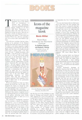
By looking at so many covers, the editors have isolated and identified some tendencies that the layman may never have noticed — for instance, what they call the torn effect', as in 'the shooting fist of characters who seek to break out of their paper prison'. They nicely compare this with circus acrobats diving through paper hoops. Art Deco is in the news; and in this book we find not only glorious Deco covers, such as that for L'Officiel (1934) but also prime examples of Deco revival, among
them a cover for Hammes magazine (1971), drawing on the original style, yet inescapably different from it.
The editors make some telling criticisms of contemporary covers. I cheer to the echo, and indeed the Echo, their strictures on the way many modern covers are turned into ugly, chaotic jumble sales of cover-lines:
These days magazines tend to use their covers to advertise their interior. Headlines, subtitles, advertisements and lists of contents jostle together where once the image reigned supreme ... It's hard to know sometimes who [sic] this strategy serves. Does it reassure the reader by telling them [sic] exactly what lies inside? Or do the editors of the magazine feel happier when all of its wares are on display?
I wish they had also turned their wrath on the editors of Saturday and Sunday newspaper colour magazines, most of whom fail to do what Paul Johnson told them years ago, in this magazine, they should do — which is to exploit the colour potential of the better-quality paper on which they are printed. This does not mean that Tony Blair must be photographed in a Max Miller suit, or that hard news stories and scoops are ruled out; but when I open my colour magazine I do not want to be confronted by a grim, grey waste.
Perhaps because of the many cooks of this broth, the text is oddly uneven, The writing can be as passably appetising as this:
For an actor to become a legend they [sic] must repeatedly play roles that have been proven to work best for them, with little variation: the heartbreaker (Rudolph Valentino), the disillusioned cynic (Humphrey Bogart), the lost adolescent (James Dean).
But it can also be over-colloquial, as here:
Punch was brought out by the publishers and printers Bradbury and Evans whose stable included Charles Dickens. This provided the perfect opportunity for the editorial team to cosy up to the great novelist.
Or it can plunge into absurd bathos, like this:
Under the influence of the even more dangerous Hitler, II Duce revealed his criminal yet farcical nature.
On the whole, then, it is probably just as well that the editors conceived a book with a maximum of pictures and a minimum of verbiage. What is regrettably lost in this piece of horse-trading is any worthwhile account of the people behind the covers. Some of them are missing altogether. We hear about the street-scene cover of the 1890s Strand Magazine, but its designer, George Haile", is nowhere mentioned. (There is much by and about him in the publications of that curious Victorian society, Ye Sette of Odd Volumes, of which Ha ite was president — 'His Oddship' — in 1891.) The 1930s covers for Minotaure by Picasso, Duchamp, Miro, Matisse, Magritte and others are noticed; but the man who financed the magazine, John Betjeman's friend Edward James, is Awol. Among the great Punch artists of the 1950s, Ronald Searle gets the barest mention. Thelwell none.
There is quite a good account of the founding of the Sunday Times 'colour supplement' — as the magazine was then called — in 1961-2; but its first editor, the late Mark Boxer, deserves more than a glancing reference. Recalling his difficulties with the launch, he told me, 'Never, start anything, Bevis. You make all the mistakes and get all the blame. Then somebody takes over when you've got everything running smoothly.' For some reason, a disproportionate number of covers of the Telegraph Sunday Magazine is reproduced, although its covers were rather weedily designed; but again it is Hamlet without the Prince of Denmark — not a smidgen about its long-term editor John Anstey, a monstre not very sacre, known as a great sacker and a great survivor. A double-page spread is given to the Tatler, with no allusion to how Tina Brown revolutionised, in 1979, what had up to then been a silly snob magazine.
Similarly, we have Vogue with no Beatrix Miller: I won't say that's Macbeth without Lady Macbeth. The book's editors do offer us — how could they not? — Diana Vreeland, the autocratic, bird-of-paradise American Vogue editor; but, when they rightly deprecate the lunatic sums that are spent on laborious and largely worthless 'reader surveys', 1 regret they do not quote her words, which should be set in burnished gold above every magazine editor's desk: 'We must give our readers what they never dreamed they wanted.'