


to convey the right idea of a still youthful maturity.
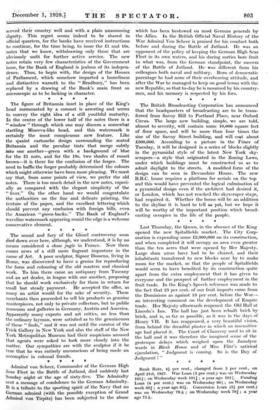
In the centre of the lower half of the notes there is a " window " through which one may discern a somewhat startling Minerva-like head, and this watermark is certainly the most conspicuous new feature. Like the quaint cartouche design surrounding the seated Britannia and the peculiar tints that merge subtly into one another—green with a background of blue for the £1 note, and for the 10s. two shades of russet brown—it is there for the confusion of the forger. The need to baffle the forger probably determined the colours which might otherwise have been more pleasing. We must say that, from some points of view, we prefer the old notes. There is too much detail in the new notes, especi- ally as compared with the elegant simplicity of the " fiver." On the other hand we would congratulate the authorities on the fniee and delicate printing, the texture of the paper, and the excellent lettering which should prevent any confusion with foreign bills, even the American ." green-backs." The Bank of England's waveline watermark alipearing round the edge is a welcome conservative element.