


True colours
Andrew Lambirth Helio Oiticica: The Body of Colour Tate Modern, until 23 September Supported by Art Mentor Foundation Lucerne John Piper Room 20, Tate Britain, until 24 January 2008 How diminished our lives would be if suddenly we could only see in black and white. 'Colour is the first revelation of the world,' exclaimed Hello Oiticica (1937-80), a Brazilian artist with a mission to liberate colour and help it to embody itself in other guises. He thought of colour as a dimension, like space or time. How far would he have travelled if his tragic early death had not stopped short his career? He had already gone beyond helping colour to escape from the imprisoning rectangle of the picture frame and move into three-dimensions; he had even given it human locomotion and brought it into the arena of performance. Where would he have taken it next? A film at the end of this intriguing exhibition charts the path of increasing frenzy in Oiticica's work. Perhaps he had literally gone as far as he could.
Oiticica is not well known in Britain — though the Whitechapel did mount an important exhibition of his work in 1969 — but, on the evidence of this exhibition, he certainly deserves to be. The show starts with small abstract paintings, slightly reminiscent of Klee, which also made me think of the neon-bright grids of the contemporary American artist Peter Halley (born 1953). These are mostly painted in gouache on cardboard, materials which Oiticica continued to explore (shown here in Room 2), with greater invention and succinctness. This is a glorious room of near-geometric designs: open-angled box-shapes in red or blue, or black-and-white bars and quadrilaterals. Oiticica plays with geometry with an instinctive grace and a sure eye for placing, manipulating his forms in the spirit of Ellsworth Kelly rather than with any trace of academicism. These gouaches have the crispness and cut-out quality of collages, and a wit and inventiveness of shape that is immensely satisfying. It is this shape knowledge that Oiticica will soon take into threedimensions.
Indeed, in the next room is a group of white-on-white paintings, with three painted fibreboard hanging shapes in their midst. These 'Bilaterals', or 'paintings in space', as Oiticica called them, are further developed into two-toned irregular shapes, which then progress into full-bodied colour. Room 5 contains five of these wedgy structures, suspended plywood variations on the triangle in angled planes. By Room 7, Oiticica is growing bolder and more experimental, constructing freestanding plywood boxes distempered with colour, filling them with shells or crumbs of polyurethane foam, or loading pure pigment into glass bowls. Meanwhile, around the walls is a series of 34 small square panel paintings called 'Inventions', in single colours brushily applied, ranging from orange to pink to Indian red.
The next step is into installation, and making a kind of open maze of coloured wooden panels vertically suspended. These 'chromatic environments' are not terribly interesting, though the largest, 'Grand Nucleus', has real presence, with its pale-violet centre radiating out into yellows and oranges, hanging over a wooden trough filled with white pebbles. The idea is audience participation: the sculpture is to be walked around and, in the case of 'Penetrable', into. This small wooden cabin (a bit like a Portaloo) doesn't have a lot to offer, but in the next gallery, Room 9, are the capes Oiticica designed to be danced in. Here also is the film of happenings with its distracting soundtrack (a cross between a horror film and a cop flick, all too audible through the other galleries), featuring people dancing the samba and running around draped in bits of plastic. The carnival atmosphere has an air of desperation and the faint odour of mothballs. 'My aim was to trigger states of invention,' said Oiticica in 1979. A fair ambition if a bit unspecific.
One artist who was using colour in an equally radical way, and who by coincidence also died young, was Jeremy Moon (193473). Tate Britain has just had a display of seven of his large paintings with a group of luscious studies, which will sadly be over by the time you read this. But Moon deserves to be remembered (there are a couple of publications on him) for his daring minimal grids and joyous expanses of colour; for instance, an orange field with pink edge bands. Another exhibition at Tate Britain which goes on a bit longer is an archive display in Room 20 of the work of John Piper (1903-92), which celebrates the completion of cataloguing the John and Myfanwy Piper Archive, bought by the Tate (with assistance from the Heritage Lottery Fund) in 2004. Here in miniature is the world of Piper the industrious artist and antiquarian, showing his work from sketchbook to finished painting, in the kind of in-focus exhibition the Tate does so well.
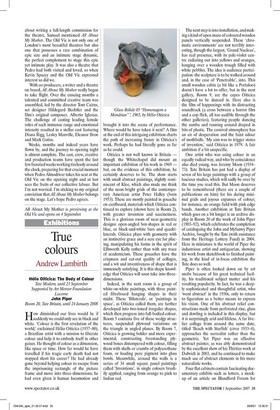
Piper is often looked down on by art snobs because of his great technical facility, his traditional subject matter and his resulting popularity. In fact, he was a deeply sophisticated and thoughtful artist, who 'went abstract' in the 1930s, only to return to figuration as a better means to express his vision. One of his abstract relief constructions made from perforated zinc, glass and dowling is included in this display, but it is surprisingly arid and lifeless. A far livelier collage from around the same date, titled 'Beach with Starfish' (circa 1933-4), approaches the surrealist rather than the geometric. Yet Piper was an effective abstract painter, as was ably demonstrated by the excellent show of his Thirties work at Dulwich in 2003, and he continued to make much use of abstract elements in his more naturalistic works.
Four flat cabinets contain fascinating documentary exhibits such as letters, a mockup of an article on Blandford Forum for Architectural Review, sketchbooks and some of Piper's own photos (a particularly fine one being of the font at Toller Fratrum). As he remarked once to John Craxton, 'If I'm known in history as a good topographical artist, I'll be pleased,' so the topographical notes and studies here reveal him to be something of an expert in place and architecture, and their various histories. Here are exquisite mixed-media sketches of landscape, rapt with abstract squiggles and descriptive notations, which capture so well the dynamics and appearance of the countryside.
Around the walls are a selection of lithographs and screen prints, and three substantial oils. One is surprising, a large gestural painting on very rough canvas of the Forum in Rome, but the desolate beauty of 'St Mary le Port, Bristol' from 1940 is quintessential Piper. The bombed church is depicted with love but also with anger (note the heavy scoring of the surface) at its wanton destruction. The third painting, `Yarnton Monument' (1947-8), is romantic and theatrical, dark and light fighting it out in an Oxfordshire church. Piper wrote in one of his sketchbooks, 'The real merit of British painting is that it is, at its best, romantic, un-classical, particular, fanatical, self-obsessed and the product of close observation in a misty country that has long winter evenings.' Piper's own considerable gifts, and he was a very good writer as well as everything else, give eloquent voice to a period of British painting which is often now dismissed for being too provincial and insular. It is neither, but its subtle charms require an enthusiasm for the past which few now seem to have time for.