


Tarting up the word
Bevis Hillier
FRONT COVER: GREAT BOOK JACKET AND COVER DESIGN by Alan Powers Mitchell Beazley, £20, pp. 144, ISBN 1840004215 In 1956 Nancy Mitford contributed, with Alan S. C. Ross and others, to the book Noblesse Oblige, about the language and mores of the English upper classes. She wrote as an insider, and that might be thought an advantage. Not so. It is the outsider who is best able to identify the characteristics of a group or society. No gorilla could have done anything like as good a job as Diane Fossey; and an Englishman will spot, more acutely than an American, what is most admirable, typical or comic about Americans. (I lived in the United States for five years and found that, though they think what they love is giber-dee', what they actually love is `authori-dee'. If you think America and freedom are synonymous, just try becoming a communist there. 'Mandatory', uttered with lipsmacking relish, is the favourite word of their lawyers. In 1984 a woman was stripsearched for not having a dog-licence. If you drive your car into the 'Out' alley of a parking lot, metal spikes rear up like dragons' teeth to rip your tyres to shreds — something that I trust is still unthinkable in England.)
So I'm afraid Nancy missed many of the habits and expressions of the upper class. Being of the noblesse herself, she did not notice some of the deeds and words of her friends and family that were bizarrely at variance with those of the lower classes. For example, she did not register that 'U' people put salt on the edge of their plate in a little pyramid, while the workers sprinkle it with happy abandon all over their plate. (I once asked a '1_1' friend, wasn't it rather tiresome to have to dip every forkful in the salt, rather than doing the salting in one dashing action before starting to eat? He replied, 'Ah, but I might not want salt on every forkful.' There you go — the discriminating palate of the aristo.) Similarly, Nancy missed the fact that 'LP people put jam in a messy deposit on the side of their plate, then transfer it to their bread-andbutter; workers whizz it straight from the jam container to the bread. ('U' people don't have to do the washing up — or at least, they didn't in 1956.)
Nancy Mitford also failed to observe the social nuances of 'mackintosh' and 'raincoat', or to join in the great 'wellingtons' versus 'gumboots' debate. Visiting the Literary Longfords in Sussex one freezing winter. I found they favoured 'gumboots'; but of course, the great Duke of Wellington married a Pakenham; perhaps the family didn't want their illustrious kinsman to be associated with rubber goods. Neither Nancy Mitford nor Alan S. C. Ross – a Finn — noticed the weird 'U' pronuncia tion of 'system' as `sys-tim% (By the way, can Dot Wordsworth kindly explain why, although 'kingdom' is pronounced 'kingd'm'. 'condom' is pronounced by one and all as if the second syllable were the first of Dominic? Oh, and could she also tell me if American Christians. when saying the Lord's Prayer, intone, 'For thine is the presidency, the power and the glory ....?) Nancy Mitford also missed 'receipt', as used by the upper classes for what most of us, in the context of cookery, call a recipe. I first encountered this strange archaism when going round Knole as a tourist, about 1960. 'The pot-pourri is made from an original receipt of Lady Betty Germaine,' said the upper-drawer lady guide. At the time I thought she was mispronouncing 'recipe' as 'receep', rather as a Welsh guide to Cardiff Castle, drawing attention to a carving of Sophocles, pronounced the name something like 'bicycles'. The Spectator's sub-editors must be frightfully 'U': on the rare occasions when I use the word recipe in an article, it is always altered to receipt. I prefer recipe as less ambiguous: a receipt is principally what one gets from the payee in return for some cash. I appeal to Dot Wordsworth on that one, too. Again, I don't suppose Nancy Mitford ever in her life received a wedding invitation printed in silver or gold; so she never realised that only the upper classes send wedding invitations printed in black.
I have recently read of a not vastly 'U' man who was pulled up sharp by an overbearing 'U' one. When the non-'U' asked, 'Do you mind if I take off my jacket?' the `U' spluttered, 'Your coat, man! Only potatoes have jackets. We have coats and overcoats.' Nancy Mitford missed this jacket/ coat thing, too; but the overbearing chap was wrong, of course, about 'only potatoes'. Foxes have holes, and books have jackets — dust jackets, also known as wrappers. A friend of my youth was the great bibliographer John (Jake') Carter, who, with a friend, exposed the literary forgeries of the infamous Thomas Wise. (Carter's wife, Ernestine, was rather better known than he, as the fearsome, American-born fashion editor of the Sunday Times.) Though a proud man. Carter admitted to having made one ghastly mistake. When he had bought new books — say, the first editions of novels by his contemporary, Evelyn Waugh — he at once took off and threw away their jackets. His thinking was, 'Well, the jackets are to protect the books from dust, and the books will encounter precious little of that in my glass-fronted bookcases.' What he did not realise was that (a) the value of 'modern first editions' would come to depend, to a great degree, on their dust jackets being present and in good condition; and (b), even more extraordinary to him, people would one day collect books for their jackets.
That was already beginning to happen in 1970, when I contributed an article to the Guardian under the headline 'A case for book jackets' (21 January 1970). I wrote that if you were looking at 'antiques of the future' for investment, the best bets might be the book jackets and record sleeves of the Seventies. I wish I had taken my own advice. Jackets and sleeves bought then and kept in mint condition would now be worth a mint, in aggregate.
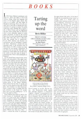
Two things, in particular, had made me turn to the subject of book jackets in 1970. First, Michael Farrell, of Bentley-FarrellBurnett Designs, had just sent me his outstanding Art Deco revival design for the jacket of Sir Anthony Gibbs' autobiography. In My Time — a book full of selfmocking sketches of the 1930s and cloak-and-dagger sprees in the second world war. Alan Powers does not reproduce or mention it in his new book, so I show it here. I wrote of it in 1970:
Farrell does not just treat the jacket as two rectangles joined together by a spine, but as one complete canvas, with a design that flows triumphantly from front to back.
The other thing which focused my attention on book jackets was the publication. by Thames and Hudson, of Kurt Weidemann's Book Jackets and Record Sleeves. The book does not figure in Powers's bibliography, which is select to the point of starvation. So he misses Weidemann's suggestion that the oldest known book jacket in Britain was designed in 1833 for The Keepsake, published by Longman's.
Alan Powers is one of our most impressive historians of design and architecture. He is a senior lecturer at the University of Greenwich School of Architecture and Landscape. His sterling work for the Twentieth Century Society has helped to save notable modern buildings. He is chairman of the trustees of Pollock's Toy Museum. And he has written several books, including two published this year: a life and study of the designer-architect Serge Chermayeff and (with Elain Harwood) a mammoth issue of the Twentieth Century Society's journal, on the Festival of Britain — a 50th anniversary tribute to the Festival which doughtily complements the V&A exhibition and book which Mary Reyner Banham and I produced for the 25th anniversary in 1976. He is altogether a scholar to be reckoned with; but the book on book jackets is a disappointment.
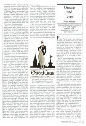
Powers has a somewhat dour, Pevsneresque attitude to design. I think a book jacket should almost always be a miniposter, shrieking across the bookshop, 'Buy me!' You may take that as the view of an author who would like his books actually to sell rather than win prizes for tasteful design. The best, gaudiest jacket ever designed for a book of mine was again by the Bentley-Farrell-Burnett team, for my Austerity/Binge (1975), about the decorative arts of the 1940s and 50s. I reproduce it here. Perhaps some will merely see it as further evidence that the Seventies were 'the decade that taste forgot'; but massed copies made a great polychrome splash in the windows of Hatchard's and other bookshops: and I think that Peter Bentley, the chief designer of this jacket, showed outstanding skill in transmuting post-war motifs into something unmistakably of the later decade to which it belongs.
Perhaps I might also mention the worst jacket ever designed for one of my books, though I shall not name the designer, as he is still a good friend and this was a one-off lapse. The book was John Betjeman: A Life in Pictures (1984), published by the late David Herbert (not the Morocco-based brother of Lord Pembroke), also a friend. While I was away in America, he and the designer concocted a jacket of which these were the disastrous elements: a ground colour that could be politely described as chocolate brown: a virtually unrecognisable photograph of the poet as the main image; and an almost indecipherable signature of his as the title. What the book lost shrieking across bookshops, I made up for when I received a proof. By then it was too late to change the jacket, which had all the allure of a rectangular mud pie.
While Powers agrees that book jackets need to stand out, he writes: 'This can be achieved by speaking quietly amidst a lot of
noise as readily as by shouting in a void.' With respect, has he ever tried speaking quietly amidst a lot of noise? He is fascinated by — and gives much space to — the development of austere jackets and covers for Penguin books. The barebones architectural equivalent would be the Tecton partnership's gorilla house (1932) and penguin pool (1933) at London Zoo, and their Highpoint Flats in Highgate, London (1935 and 1936-38); whereas the equivalent of the sort of jacket I champion is an architecture that sets out unashamedly to sell, such as the flamboyant Art Deco façade of the Hoover building by Wallis, Gilbert & Partners. What really interests Powers is modernism. He writes that
Modernism in book jackets is a broader matter than avant-garde visual style — it is a genuine symptom of modernity as an unstoppable force, taking any number of forms.
He is much less interested in the way that jackets mirror changing society — in representing costume, for instance. He is not very concerned, either, with the books that lurk behind the jackets: in this he is the exact opposite of Jake Carter. A small mistake that he makes is symptomatic of his attitude. He captions one of the jacket reproductions: 'John Pope-Hennessy, London Fabric, London, published by B. T. Batsford, 1941. Jacket design by Eric Ravilious.' The jacket is slightly torn, halfobscuring the Christian name of the author, who was not, in fact. John PopeHennessy, successively director of the Victoria & Albert and British Museums, but his brother James, the royal biographer who was murdered by a rough-trade pick-up who was trying to batter out of him the whereabouts of the advance he had received (but long since spent) for a never written biography of his friend Noel Coward. It is a minor slip, but one that suggests that Powers has not always riffled through the books, but has been content just to cover covers — though no doubt he would argue that one cannot judge a cover by its book.
Let me say for his book what can be said for it. It is well produced, with a largish format and a most generous allotment of colour plates. Any art student or designer will enjoy looking through it and may take inspiration from it. When he lets himself off the leash, Powers writes with a lot of style, as in this passage:
Book publishing is a domain where Hermes and Athene rule together. The goddess of wisdom must embrace the mercantile trickster. for they cannot live without each other. The book cover is the marriage broker, and is continually driven to seduce and deceive, even if in the most charming and learned ways.
He analyses clearly how, in the 1940s to 1960s period, jacket design ceased to be a Cinderella art for an 'odd job man' and became a task for a grandiose 'graphic designer'. The book is divided into easily assimilable, if rather arbitrary and oddly sequenced. sight-bites, with sections on some of the leading designers, such as Rayilious and Bawden, Barnett Freedman, E. McKnight Kauffer and the superb calligraphic and brush letterers of the 1950s, But there is a sense of homework not adequately done — certainly not done with the application we have come to expect from Powers. It is as though someone has made a quirkish collection of book jackets and slapped them down on a set of sheets, with the minimum of explanatory text.
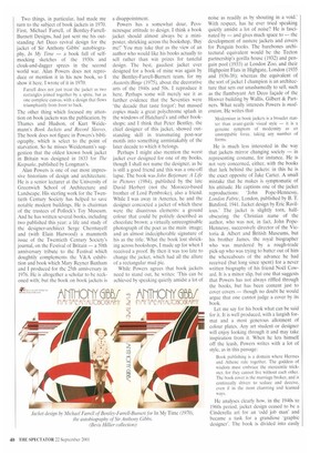
Some of the generalisations are too swashbuckling. When Powers writes that 'book jackets only had a marginal existence before 1930', he is firing the starting-gun too late. In 1922 The Oxford Circus was published, a novel by Hamish Miles and Raymond Mortimer — the latter much better known, 40 years on, as a Sunday Times book reviewer. (Read all about him in Frances Partridge's diaries.) In my copy of the book, which Mortimer signed for me in 1976, somebody has thoughtfully pasted the front wrapper inside the front cover, so it has remained snowily virginal, as shown here. Plenty of books had jackets in the Twenties. Some fine designers are omitted altogether — among them, Eric Fraser, Eric Newton, Henry Hoyland and Gilbert Rumbold.
With the artists he does represent, Powers misses some key designs: McKnight Kauffer's surreal image for John Betjeman's Continual Dew; Thayer Lee-Elliott's Art Deco jigsaw for Francis Hackett's Henry VIII (with unconscious irony, the author is billed on the jacket as 'author of That nice young couple); and Richard Chopping's haunting design for David Benedictus's Eton novel The Fourth of June. a jacket far more distinguished than those for the James Bond novels which Powers reproduces. Bentley-FarrellBurnett are represented, but only by one of their, to my mind, less successful efforts, a pastelly, whimsical design for one of the Evelyn Waugh Penguins. None of the jackets for P. G. Wodehouse's books is mentioned: the designers included W. Heath Robinson (If I Were You, 1931), Rex Whistler (whom Powers does mention in other contexts), Ian Fenwick, Frank Ford and Osbert Lancaster. In 1959 Lancaster had designed an amusing jacket for Lord Kinross's book about the Americans, The Innocents at Home, depicting the things for which Americans were then most noted over here — finned cars and men with crew-cuts and buttons on their shirt-collars. He made his Wodehouse debut in 1967 with Company for Henry. Although there are perfunctory notes on some book jacket designers. Powers does not seem to be interested in them as people. Laurence Whistler's book on his brother. Rex. and Mark Haworth-Booth's on McKnight Kauffer (again, both are absentees from the bibliography) would have given him ample 'background' on those two artists.
Briefly curbing his predilection for 'clean lines', he concedes us a double-page spread of Sixties and Seventies 'Psychedelia', including Martin Sharp's calculatedly chaotic design for Richard Neville's hippie manifesto of 1970, Play Power; but yet another book missing from his bibliography is Patrick Woodroffe's Mythopoeikon: Fantasies, monsters, nightmares, daydreams: the paintings, book jackets and record sleeve designs, with a commentary by the artist (Paper Tiger, 1976). All those dragons, wizards and pinnacled castles would not be up Powers's Strasse at all. When I look at his coverage of the last 20 years, I see a steep decline from the Seventies. Powers does not. 'Profusion seems to be giving way to a new simplicity,' he writes approvingly. As an aside, he makes the perceptive comment that 'now we have a new challenge: jacket legibility in a thumbnail icon on a website is almost as much a requirement as legibility across a crowded shop'. (Jackets should also make a vivid impact when miniaturised in newspaper line-ups of Booker and Whitbread shortlists.) This is surely a case where the 'functionalism' so often urged by Pevsner should not mean sobriety and glumness. Powers rightly gives good space to Jeff Fisher, who designed the striking jackets for Will Self's Cock and Bull (1992) and Louis de Bernieres's Captain Corelli's Mandolin (1998). But I cannot share his enthusiasm for the dreary monochrome jackets for books published by Rebel Inc, or the dung-coloured wrappers for Canongate's reprints of individual books of the Bible. If they think this is a smart way to attract people to religion, perhaps they should remember Joseph and his coat of many colours. Or was it a jacket?