


From dumb to singing pictures
William Feaver
PATRICK CAULFIELD PAINTINGS by Marco Livingstone Lund Humphries, £35, pp. 224, ISBN 0853319170 Patrick Caulfield’s paintings look specific while giving us tantalisingly little to go on. Where are we? Seemingly, a spotlight moves, the disc of dislocated brightness slithering over tablecloth, tankard, swirly-plastered wall and simulated half-timber. Could this be a Vermeer-themed hostelry for the discriminating guest? Details punctuate the ambience. Take a pew, why don’t we, and let each picture absorb us.
Things like chained pen sets and buttoned-effect wallpaper are stimulants for Caulfield, his eye-catchers, his wherewithal. Everything about them, the silhouettes they present, the shadows they cast, the angle they are seen from, the way they are painted, is calculated to clue us in; intense colour, deployed with verve, makes the details float and shine like heraldic devices in immaculate picture space.
What surprises, in a handsome book illustrating Caulfield’s progress, from his sly homages to banality of 40 years ago to the magnificent golds and purples and six degrees of shadow of ‘Bishops’, his most recent painting, is the elliptical darkening of mood. In his text (largely composed of essays originally published in exhibition catalogues) Marco Livingstone talks about ‘the forlorn artefacts and interiors that have fostered his visual thoughts’. Forlorn, yes, but Caulfield has always relished the way things mutely communicate. Given an ashtray or a dozen wan daffodils, who needs plonking human presence? At every turn he demonstrates that impact is exacerbated by understatement.
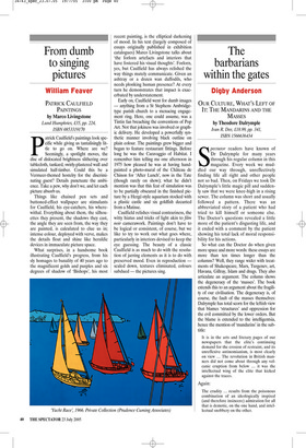
Early on, Caulfield went for dumb images — anything from a St Stephens Ambridgetype parish church to a menacing engagement ring. Here, one could assume, was a Tintin fan breaching the conventions of Pop Art. Not that jokiness was involved or graphic delivery. He developed a powerfully synthetic manner involving black outline on plain colour. The paintings grew bigger and began to feature restaurant fittings. Before long he was the Caravaggio of Habitat. I remember him telling me one afternoon in 1975 how pleased he was at having handpainted a photo-mural of the Château de Chinon for ‘After Lunch’, now in the Tate (though rarely on show); what he didn’t mention was that this feat of simulation was to be partially obscured in the finished picture by a Hergé-style aquarium stocked with a plastic castle and six goldfish decanted from a Matisse.
Caulfield relishes visual contrariness, the witty hiatus and tricks of light akin to film noir camerawork. Paintings don’t have to be logical or consistent, of course, but we like to try to work out what goes where, particularly in interiors devised to keep the eye guessing. The beauty of a classic Caulfield is as much to do with the resolution of jarring elements as it is to do with preserved mood. Even in reproduction scaled down, textures eliminated, colours subdued — the pictures sing.