


Exhibitions
Image and Idol: Mediaeval Sculpture (Duveen Galleries, Tate Britain, till 3 March)
Shaken and stirred
Martin Gayford
When you come to think of it, the territorial zones of the London museums are as arbitrary and higgledy-piggledy as any other grand old British arrangement — the street-map, say, or the constitution, or weights and measures. Old Master prints and drawings, for instance, are at the British Museum along with the Egyptian statues, not at the National Gallery with the Old Master paintings. Constable oil sketches are at the V&A — with the furniture, and more prints and drawings — not at Tate Britain where the other Constable paintings are (except the ones that are at the National Gallery).
It's all splendidly irrational, and muddled. and English — not at all like the way things are done, for example, in Paris or New York, where almost everything of the same period is bundled into one huge centralised museum (the Grande Louvre, the Met). All the better for that, some might say. Still, personally, I was pleased when the new — or renewed — Tate Britain took the bold step of exhibiting some mediaeval British sculpture in its central Duveen Gallery.
'Bold,' you might wonder, 'what's bold about that?' Well, in the firmly fenced-off world of London museum responsibilities, it was as outrageous as pinching a bit of your neighbour's garden. Mediaeval stuff lives in the V&A, as does sculpture after the Romans and before the late 19th century, by and large. I had never seen anything mediaeval or any sculpture prior to, say, Rodin at the Tate. And yet the idea of displaying the whole sweep of English art — from Romanesque to Tracey and Damien — at the new Tate Britain makes a lot of sense.
When this exhibition finally opened last autumn, organised in part by the sculptor Richard Deacon, it tended to receive only a brief mention in the tide of commentary on Tate Britain itself. But I found myself lingering several times in the Duveen Galleries, savouring this little show. I had not previously seen any of these diverse and beautiful specimens of English mediaeval carving — on loan from churches and museums up and down the country.
I found the way these pieces were presented by Deacon stimulating if unusual. A massive oak ceiling boss from York Minster, for example, is held above your head by a truss of high-tech-looking red steel beams. A couple of 13th-century knights from Furness Abbey in Lincolnshire are laid on a tomb slab of metal bearing a jazzy diamond pattern. This, admittedly, is not the way we are used to seeing mediaeval art.
But I felt it was effective in redirecting one's attention. It makes the exhibits look less like just another bit of mediaeval sculpture, which is frequently the case with such displays in, for example, the museums that adjoin umpteen Continental cathedrals. Deacon's unusual plinths — wood and terracotta are two more materials he used — and their sloping trapezoid forms make these ancient sculptures look weird and contemporary.
Those armoured knights from Furness Abbey, cracked and riven by some past catastrophe or burst of iconoclasm, look like bits of broken machinery. The wooden boss with its undulating organic lines resembling seaweed fluttering in the current, and the sharp angles where it is jointed to the roof, look abstract and odd in a manner not unlike Deacon's own work.
I was a little shaken, therefore, having quietly enjoyed this display without having written much about it, when I opened the current edition of Modern Painters, and read an attack on the show by my colleague Richard Dorment. What he has to say is so hot and strong that the glossy pages on which it was printed positively sizzle. This, he writes, is with one exception (a display two years ago at the V&A) 'the single most insensitive installation I have ever seen As an example of curatorial or artistic egocentricity, what Deacon has done here is hard to beat.'
Now, Richard Dorment is a critic whose judgment I greatly admire, and with whom I frequently agree. And sculptural plinths are a matter about which strong feelings are often aroused (the late David Sylvester once referred to a friend as 'someone who can judge plinths for Giacometti better
than anyone alive' — and he meant it as the highest praise). But here I think Dorment has got it wrong.
He feels, obviously strongly, that only plain white plinths would be proper for such an exhibition (the kind, in fact, that would be absolutely right for Giacometti). This art needs space, and light, and long vistas.'
But though a good exhibition could have been made in this way, there is no law of heaven that it has to be exhibited in a manner derived from neutral, mid-20th-century modernism. As a matter of fact, the context for which these works were made was anything but cool, light-filled and uncluttered.
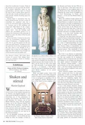
It was in many cases much more jazzy than anything Deacon has dreamed up — covered in polychrome tracery, dimmed by stained glass, jostled by tombs, brasses and wall plaques. A photograph of the early 16th-century St George from Eton Chapel in situ shows it perched on a gothic column and jammed up against an ornate gilt organ case. Deacon's installation, on a black steel column, is a good deal more austere and spacious.
Any way of putting venerable religious art into a 21st-century museum is going to be artificial and to an extent arbitrary. But the way this show has been put together at Tate Britain — for me, at least — is effective and original, and most of the work enormously beautiful. If you have not done so, I suggest you take a look before it ends a month from now.