


American beauty
Andrew Lambirth
The American Scene: Prints from Hopper to Pollock British Museum, until 7 September Coming of Age: American Art, 1850s to 1950s Dulwich Picture Gallery, until 8 June
Although the potent influence of all things American has had a pernicious not to say deleterious influence on street culture and social attitudes in Britain, American art of the last century has offered a stimulus to many and certainly a yardstick to measure up against. Our art has not simply been made in the shadow of the American achievement (whatever Clement Greenberg might have wanted to think), but the extent and richness of the experimental territory covered by American painters (and to a lesser degree sculptors) between 1850 and 1950 remain a lasting inspiration. Two exhibitions draw attention to this period, one of them a model of scholarship, the other strangely disappointing.
The British Museum show is a revelation. Not only are there a number of artists of real quality here whose work I was totally unfamiliar with, but the images by the better-known artists are for the most part marvellously fresh on the eye, too. Prints are sometimes disparaged as mere reproductions, poor man’s art, multiple editions intended to reach a larger audience than the exclusive painting, and, as such, somehow cheapened and diluted in effect. This is rubbish. A good print is a very fine thing indeed. In this show we see what can be done with techniques as different as etching and lithography, woodcut and screenprint. The range of imagery and the mastery of medium is wonderfully displayed: there are dozens of things here that would grace and enhance any first-class art collection. It is no idle boast when the British Museum claims to have the best collection of American prints from the late 19th century to 1960 outside America itself.
There are 147 works by 74 artists on display. The exhibition was humming the afternoon I visited it (literally so — the air in the galleries was very close), with a good crowd of people milling about even though it wasn’t raining outside. The exhibition is prominently flagged up throughout the museum, so it’s difficult to miss it, but there did seem to be at least half-a-dozen serious spectators spending time with the exhibits. The show is unemphatically divided into 12 loosely chronological sections and starts in 1905 with John Sloan and the Ashcan School of gritty realism. A crucial figure in New York art circles, Sloan is represented here by nine etchings, his wiry line capturing a variety of ‘low-life’ subjects, from a blowsy lady turning out the light for an expectant male, to overheated sleepers taking to their apartment rooftops on sultry summer nights. Here follow a couple of nicely contrasty drypoints by Peggy Bacon, a pupil of Sloan, showing art students at work and in the lunch room.
Hung off to the left in a place of its own is the best-known lithograph by George Bellows, depicting a prizefight and somewhat obscurely called ‘A Stag at Sharkey’s’ (1917). Bellows was the poet of boxing, his dynamic images full of drama and cleverly worked human detail. There are several of his dark figure compositions on show; for a change of mood, turn to the delicately coloured still-life woodcuts of Blanche Lazzell and Grace Martin Taylor, marvels of compact pattern-making. I also liked the Milton Avery black-and-white woodcut ‘Night Nude’ (1953), a long and toughly expressive piece, quite different from his more overtly descriptive landscape ‘Drawbridge’ from 1936.
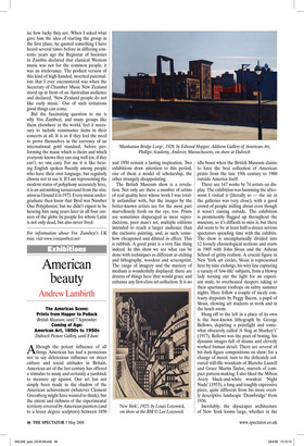
Inevitably, the skyscraper architecture of New York looms large, whether in the futuristic and geometric images of Louis Lozowick or the precisely drafted ascent of Charles Sheeler’s ‘Delmonico Building’ (1926). A group of Edward Hopper etchings introduces the theme of the so-called American Scene, mostly night subjects, with a particularly poignant view of a naked girl taking the evening wind on her skin. There are far too many beautiful and arresting prints in this show to list them all by name, but let me just mention the extraordinary light in ‘The Race’ (1942) by Thomas Hart Benton, the sensual Iowa landscape in Grant Wood’s ‘March’, the Gothic savagery of Leonard Baskin, the lucid geometry of Josef Albers and Harry Bertoia, S.W. Hayter at his serpentine finest, the flaring forms of Latvian-born Adja Yunkers, and splendid things by Pollock and Louise Bourgeois.
The catalogue by Stephen Coppel (£25 in paperback) is excellent, packed with accessible information elegantly laid out around the illustrations. This must be an inspiring show for any artist but particularly for printmakers, yet its appeal is by no means limited to the specialist: the general public will also find a great deal to enjoy. If you don’t manage to see the show in London, it is touring in 2009, to the Djanogly Art Gallery in Nottingham (January to March), Brighton Museum and Art Gallery (April to August) and then to the Whitworth Art Gallery in Manchester. The British Museum does the best print displays I’ve seen anywhere: I can’t recommend this show highly enough.
In comparison, Dulwich’s show starts well, but then fades away. It isn’t helped by its title, which leads the visitor to expect greater things than are delivered. All the exhibits come from the Addison Gallery of American Art in Massachusetts, which has quite clearly pursued a policy of buying names rather than paintings. In other words, minor works by major artists tell a different story, in footnotes rather than headlines. That’s not to say that there are no enjoyable pictures here.
In the first room, a small Frederic Church offers a vast panorama, and ‘The Coming Storm’ by Albert Bierstadt is a lovely piece of evocative landscape painting, intense and meticulous in its handling. Ralph Blakelock offers a combination of moody colour and crusty textures in ‘After Sundown’ (c.1892), which is very satisfying. In the second room, the John Twachtman is subdued but has a rather lovely shimmering surface. But there’s a garish Sargent, not a great Whistler and the large Hopper in the third room is not his most stimulating of subjects. Georgia O’Keefe as ever looks better in reproduction than in reality, as does the Man Ray, while the John Marin is frankly a mess. I love Milton Avery but can’t much admire the example here, while the Pollock has so little internal logic it looks as if it were cut out from a larger canvas. Baziotes and Albers acquit themselves better than most, but, as an account of the glory years of American art, this show is a failure.