Architecture
Terracotta and taste
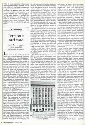
Alan Powers argues for a revival in colour and ornament If you stand in the middle of Russell Square, you can understand why terracotta got a bad name at the end of the 19th cen- tury. Some hapless architectural advisor to the Bedford Estate decided that the way to modernise the staid Georgian houses was to apply ornaments in this popular red material, matching the twin hotels, Russell and Imperial, on the east side of the square, of which only the former now sur- vives, and which was the less flamboyant of the two. The Hotel Russell may now be acceptable Edwardian froth (its ornamen- tal details are finely modelled), but the period from 1900 to 1914 was devoted to the eradication of terracotta from 'polite' architecture, with such success that hence- forth it was only tolerated for seaside build- ings, cinemas and other vulgar building types. Gentlemen architects (and this is what most of them aspired to be), used tra- ditional brick and Portland stone.
It was an exclusiveness with unfortunate consequences. Excessive tastefulness meant that England never benefited from the last great decorative style in architecture, Art Deco. The experiment in architectural colour initiated by Halsey Ricardo in Sir Ernest Debenham's house in Addison Road remained an isolated occurrence. As Michael Stratton reveals in his book, The Terracotta Revival (Gollancz, £30), the first historical survey of the subject, the Ameri- cans were left to carry forward the idea that a man-made material could cover the steel frames of the new skyscrapers, provid- ing cladding and decoration at the same time. The greatest exponent of terracotta as a medium for relief ornament was Louis Sullivan, whose fame rested for years on
his role as a pioneer of modern simplicity. Seeing his intricately ornamented buildings for the first time in Chicago or Buffalo, one realises that this truth has to be balanced against his genius as a designer of lithe but disciplined plant ornament, novel but at the same time connected to the roots of the ornamental styles of all ages and cultures. Michael Stratton paints a touching picture of the relationship between Sullivan's mod- eller, Kristian Schneider and the architect who 'frequently took the train out to Crys- tal Lake to discuss designs with Schneider almost as an equal, and often through a shared alcoholic haze'.
Not all terracotta work was on Sullivan's exalted level, but in England, as Michael Stratton points out, even the ornaments of pubs were individually modelled for each commission, and hardly ever ordered from a catalogue. Yet architects mistrusted ter- racotta because it reduced their share in the design process. It was too often used to imitate stone carving rather than exploiting free modelling as Sullivan had done, and designers of terracotta buildings, such as Frank Matcham of the London Coliseum, could get carried away. Yet the material which gave us the limpid buffs and blues of the Natural History Museum should have had a future.
Had it not believed that ornament was akin to crime, modern architecture could have developed this ornamental language almost indefinitely in association with its other transformations of tradition. For the English, the new architecture of puritanism in the 1930s could be identified with the same gentlemanly good taste which pre- ferred its banks in stone rather than terra- cotta, its churches mildly Gothic and its country houses restrainedly Tudor. All could unite in despising the unspeakable vulgarity of the Hoover Factory, the one building of the period now universally loved. As that architectural privateer of the Thirties, H. S. Goodhart-Rendel, memo- rably wrote, 'the history of art has shown . . . that in the not very long run, the wages of good taste is death'. What is remarkable is that the rule of good taste should have continued to dominate English modern architecture so thoroughly. Although post- modernism in the 1980s threatened to side- line modernism entirely, the new age of restraint has conquered. A building like Stanstead Airport may not be as functional as it looks, but it is in perfect taste. Should it take Goodhart-Rendel's dictum to heart?
Taste can be defined in two ways. There is the conventional acceptance of the famil- iar and safe, lacking creative urgency, and there is the instinctive sense of quality which can be applied without hindrance from received opinions. It is only through exercise of the latter capacity that, architec- ture can claim to be an art, and almost everywhere it is hampered by its own and other people's second-hand opinions about modernity, tradition, and appropriateness. `Good taste' has frozen the cycle of change; perhaps we should live dangerously and throw some vulgarity into it to get things started again.
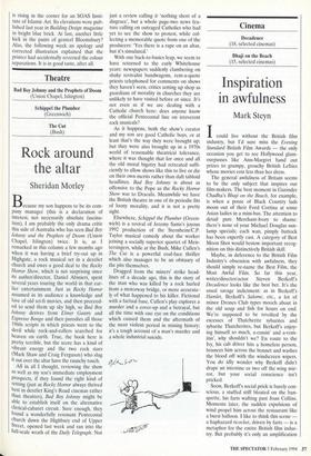
Apart from the many genuinely vulgar architects at work, there are a few, like Will Alsop, who cross the boundaries of taste with conviction. One who has gone all out for colour and surface decoration of bold- ness equivalent to the Victorians is John Outram, designer of the Pumping Station on the Isle of Dogs. Piers Gough of CZWG has contributed the green-glazed public lavatory in Westbourne Grove and the glo- rious blue tiles of the Circle, near Butler's Wharf. He was prevented from painting the outside of a converted factory near Far- ingdon Road in imitation leopard skin.
The time is ripe for change. Standard construction of new buildings involves thin cladding panels, often of synthetic material which could be decorated, patterned and coloured. It could respond to different con- ditions of light, carrying texts all over the surface of the building, merging at a dis- tance into abstract texture.
The peacock colours of Addison Road could return in the form of glazed tile claddings, composed into pictures and dec- orations in the Portuguese manner. The companies of Ibstock Hathernware and Shaws of Darwen in England and Gladding McBean in California have survived the lean years of terracotta to carry out the work, should it be required. Michael Strat- ton illustrates a few encouraging contem- porary works in terracotta and glazed tile, such as the Seattle Art Museum by Venturi Scott Brown (allegro con brio where their Sainsbury Wing was staccato nervoso), Barnard's Inn, Fetter Lane by Green Lloyd and a charming (vulgarly naturalistic in modernspeak) figure of a drummer boy modelled by the architect Douglas Binnie of Sampson Associates for the Nordoff Robbins Musical Therapy School in Lis- senden Gardens.
Returning to Russell Square, a building
is rising in the corner for an SOAS Insti- tute of Islamic Art. Its elevations were pub- lished last year in Building Design magazine in bright blue brick. At last, another little kick in the pants of genteel Bloomsbury? Alas, the following week an apology and corrected illustration explained that the printer had accidentally reversed the colour separations. It is in good taste, after all.


 Previous page