


Simplicity and strength
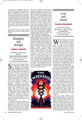
Andrew Lambirth E. MCKNIGHT KAUFFER: DESIGN by Brian Webb & Peyton Skipwith EH Antique Collectors' Club, £12.50, pp. 96, ISBN 9781851495207 © £10 (plus £2.45 p&p) 0870 429 6655 Some of the best and most effective of 20th-century English posters were designed by the American, Edward McKnight Kauffer (18901954). Born in Montana, he was the only child of German and Swedish immigrants. His parents divorced, and young Ted Kauffer was put in an orphanage, where drawing became a release from what he described as a 'lonely, nostalgic and uninspiring' childhood. When his mother remarried, his stepfather encouraged the boy's artistic inclinations, including his passionate transcriptions of Frederic Remington's cowboys and Indians paintings. He became an itinerant stage scenery painter before knuckling down to some serious study at the Mark Hopkins Institute in San Francisco, and meeting the man whose name he was to adopt, Joseph E. McKnight, Christian Scientist and Professor of Elementary Education. McKnight, his wife and daughter befriended and encouraged Kauffer, and the Professor lent him enough money to go to Paris to study art.
The progress he made to Europe was a leisurely one, via Chicago and the seminal Armory Show in March 1913, then from Baltimore on to Venice and so to Munich where he discovered the posters of Ludwig Hohlwein. In Paris at last he absorbed everything he could before impending war drove him on to England, to Durham first and then, inevitably, to London. There McKnight Kauffer was lucky to locate as patrons and friends the legendary Frank Pick at London Underground and Jack Beddington at Shell (whose joint artistic discernment led to an unrivalled series of travel posters), the typographer Francis Meynell, T. S. Eliot in his role as publisher at Fabers, and Cohn Anderson of the Orient Line, who famously described the auburn-haired McKnight Kauffer as 'a slim, russet eagle'. He continued to make and exhibit paintings until 1921, but soon realised that his real strength and originality lay in the formal geometric simplicities of graphic design, which he raised to new heights of precision and completeness.
This is the third in an excellent series of design monographs by Brian Webb and Peyton Skipwith, lavishly illustrated and beautifully produced in pocket-sized hardback by the Antique Collectors' Club. The team who've already given us Bawden and Ravilious, and the Nash brothers, Paul and John, now turn their attention to an artist slightly in danger of being forgotten. McKnight Kauffer's gloriously angular image of flight, adopted by the Daily Herald in 1919 with the copy line 'Soaring to Success!', is enough to secure him immortality without the whole string of inventive and memorable designs for posters, book jackets and such things as cotton bale labels that distinguished his career. Although Mark Haworth-Booth's 1979 book (revised and reissued in 2005) has helped to keep McKnight Kauffer's work in the popular domain, there needs now to be an exhibition to remind us of the full extent of his achievement.