Variety and continuity
Gavin Stamp admires and enjoys the new Queen's Gallery Just before the first world war, the architect Aston Webb applied a new stone facade to Buckingham Palace and was obliged to thread his giant order between existing windows, whose positions he was commanded not to alter. The resulting 'disagreeable proportions' are. as H.S. Good
hart-Rendel put it, 'distressing consequences of a cavalier treatment of neo-Classical obligations, such as never could have occurred in the first house of any land in which neo-Classicism was generally valued and understood'. Almost a century later, in a climate even more inimical to Classicism, the architect John Simpson has created a new Queen's Gallery by contriving to thread new spaces between an existing jumble of ancillary buildings at the southern corner of the palace. The result is not just agreeably proportioned but magnificently detailed and hugely enjoyable — for those prepared to appreciate architecture unblinkered by stylistic prejudice.
On the whole, the Classical revival championed by the Prince of Wales over the last two decades has been a disappointment, and I have in the past been very critical in these pages of the stiff, inept pedantry displayed by one of its leading practitioners. But perhaps I was naive in hoping for a modern creative Classicism in the spirit of, say, Hawksmoor. Soane or Lutyens to emerge when modernism was culturally and institutionally in the ascendant. A competent, intelligent, grammatical and sympathetic exposition of tradition was probably all we could reasonably hope for and this Simpson has provided — first in his interiors at Gonville & Caius College, Cambridge, and now here. To look for originality is a snare and a delusion. After all, almost all architecture — in whatever style — is derivative, and if it is acceptable for modernists to recycle the early 20thcentury ideas and details of Le Corbusier and Mies van der Rohe, then what is wrong with Simpson paying literal tribute to temples at Paestum and Pompeii, and the work of Schinkel, von Klenze. Soane, 'Greek' Thomson and — so appropriately here — Nash and Pennethorne?
It is worth recalling that Simpson won this commission in a limited competition held in 1997 (in preference to such talented and successful architects as Sir Michael Hopkins and Sir Jeremy Dixon), not just because he is a card-carrying Classicist but because of his skill as a planner and interior designer. He has succeeded in creating a harmonious progression of comfortable interior spaces on two levels running from a new entrance on Buckingham Gate to the old Queen's Gallery housed in a garden pavilion by Nash (which has been dazzlingly rebuilt internally). This involved both erecting new structures and using existing walls and volumes; the galleries run on top of modernised kitchens, while a passage used by the police runs across the entrance hall, visibly integrated within latticed screens. Only by appreciating the severe constraints within which Simpson worked can his cleverness fully be appreciated.
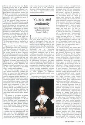
The architect's happy conceit has been to make an historical progression along the route, from primitive Classicism to a more elaborate development of the language, thereby emphasising both variety and continuity. The functionally conspicuous new entrance is a square Doric pavilion in which the origins of the Greek temple are explored by using solid timber construction as well as stone, while the copper detailing to the roof and cornice is as playful as it is exquisite. This porch stands seemingly detached from the entrance halt behind (a reference to Levverentz in Stockholm?) which is a tall, comfortable, top-lit space beyond which beckons — either side of that most powerful of motifs, a single, central Doric column — a huge (and wittily stocked) souvenir shop under Soanian domes. But the main axis leads to twin staircases rising below scagliola columns in a double-height hall consciously reminiscent of those by Leo von Klenze at the Hermitage. Beyond this, via a shift in axis brilliantly handled, the main new display space, the Pennethorne Gallery, opens up. This, like the revamped Nash Gallery beyond, is covered by an elaborate tripartite glazed ceiling which is so convincingly designed in the style of George IV's original palace that I am sure visitors will soon assume it has always been there.
Two aspects of Simpson's work deserve emphasis and praise. The first is that he is not afraid of decoration, colour and properly integrated sculpture. At a high level around the entrance hall runs an astonishingly (for today) accomplished Homeric frieze modelled and cast by the neo-Classical sculptor Alexander Stoddart, a work full of meaning, for those who wish to know which — along with the twin genii holding torches on the end wall, guarding the art works beyond — adds immeasurably to the whole architectural effect. Stoddart was also responsible for the bronze bust of the Queen which sits on axis in pride of place in the stair hail, a brilliantly subtle work which is less a portrait than a symbol of dynasty deliberately recalling the youthful frailty of the monarch, overwhelmed by the majesty of tradition, at her coronation half a century ago.
The second of Simpson's virtues is his meticulous, practical attention to craftsmanship and detail. One example must suffice. The staircase railing is of a Grecian design in the manner of Schinkel. cast in bronze, but to fulfil modern health and safety regulations, the voids between the uprights are filled by an iron rope which winds around the voluptuous bronze mouldings, hangs in loops and is finally tied around the wooden handrail. The result is exquisite and, as far as I am aware, unprecedented. Furthermore, to raise the railing height where it is horizontal, as the regulations require, a bronze rail runs above the timber one, elegantly modelled, terminated and fixed. Such intelligent, happy thoughtfulness is rare.
Simpson has an advantage, in that he is using a language of form which is rich in complexity and detail; modern technology can therefore be seamlessly and almost invisibly integrated in a way which is difficult with the self-denying austerity of modernism. Indeed, in this context, it is worth comparing the Queen's Gallery with the recently opened highly praised extension to the National Portrait Gallery by Jeremy Dixon and Edward Jones. Here the new exhibition spaces are perfectly adequate, but there is no joy in the standard detailing of steel handrails and flat white surfaces while the entrance hall, dominated by a giant escalator, is in painful contrast to the original late Victorian building. But the modern orthodoxy, parroted by critics, is that new work must be conspicuously different, in the style of our own time (whatever that may now be). But why? Simpson felt his task was to work with rather than against Buckingham Palace as it now stands, and the result should be judged according to universal, perennial architectural criteria: firmness, commodity and delight. Or, to quote dear old GoodhartRendel again, 'To object unconditionally to a style is unworthy of rational criticism — style is only a language, and can of itself neither mar nor make the beauty of what it conveys.'
An illustrated book, John Simpson: The Queen's Gallery Buckingham Palace and other works by Richard John and David Watkin is published by Andreas Papadakis at £27.50.


 Previous page