BY A CITY CHURCHYARD
Gavin Stamp regrets the secret
competition to develop land near St Paul's Cathedral
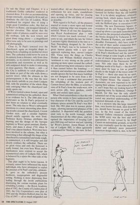
ARCHITECTS sometimes deserve to be laughed at more than they are. Always good for a laugh are the elaborately produced submissions which accompany design projects. As well as sketch plans, with lots of arrows, and flow diagrams with boxes to demonstrate an analytical approach to the demands of the brief, there are illustrations of as many historical parallels as the architect can think of or his research assistants can photocopy in the RIBA library. Then you turn the page to The old street plan around St Paul's be confronted by a design which bears no apparent relation to any of the foregoing.
This was particularly true of most of the entries in the competition for a 'master plan' to redevelop the Paternoster Square development north of St Paul's Cathedral — a competition whose farcical conduct, traditional in England, was discussed in an editorial in last week's issue. Naturally the architects' brochures reproduced lots of old plans of the St Paul's area and Wren's ideal plan for rebuilding the City of Lon- don prepared immediately after the Great Fire, as well as Covent Garden, Italian piazzas and other pretty images. Then you turn the page . . . Britain's Big Three Rogers, Foster, Stirling — naturally offered schemes of sublime insensitivity to the site, each characterised by the architect's own peculiar style of nfegalomania. The winning design, by Arup Associates, uses, ironically, concave elements from Stirling's Staatsgalerie in Stuttgart as well as other
fashionable features: a long, curving galer- ia and pine trees on stepped terraces. This lift from French Prix de Rome designs of the 18th century also characterised Richard MacCormack's submission, which has lots of trees on the roof as well as several galerie, Milan style, converging on St Paul's.
It is monstrous that a competition for one of the most important sites in London, which affects the setting of St Paul's, should have been conducted in secrecy. The public has not been allowed to see any of these entries. The Prince of Wales has, however, as they were shown to him by Mr Stuart Lipton of Rosehaugh Stanhope, one of the original developers (he has since been bought out, for £20 million). The Prince, apparently, was dismayed with all of the entries. I am not surprised, but I cannot agree with him that a classical design might be the answer. Style is irrelevant to the problem of replacing the area of comprehensive de- velopment between St Paul's Churchyard and Newgate Street planned by the late Lord Holford in 1961. What is required is an understanding of the ancient character and topography of this part of the City and of the constraints imposed by the proximity of Wren's cathedral. One is the undesira- bility of tall buildings — and in this Holford greatly sinned, for Sudbury House (actually not yet part of the development site) blocks the view of the dome of St Paul's from the north-west. Above all, what is required is an understanding that the traditional character of the City is not classical but irregular, intimate and picturesque because it is, ultimately, mediaeval.
Wren failed to make London like baro- que Rome and once his idealistic plan was rejected he came to terms with existing conditions and constraints. London was rebuilt on its mediaeval street patterns and the new St Paul's fits into this magnificent- ly. One reason why Wren deserves respect as well as affection was his ability to compromise without losing artistic integri- ty. St Paul's itself is not a pure, monumental classical conception but a compromise — that is part of its greatness. To suit the Dean and Chapter, it is a traditional Gothic cathedral rendered in classical dress. It is also an accommodating design externally, intended to fit in and yet dominate the old City of London. Wren abandoned his original idea of using a single giant Corinthian order, like that on St Peter's in Rome, and designed instead a two-tier elevation. This meant that the upper order of pilasters could be seen over the rooftops, with the west towers and great dome rising above — a magnificent effect now only to be seen in paintings and old photographs.
Close to, St Paul's towered over the churchyard, again an irregular shape re- sulting from rebuilding on mediaeval street lines. The cathedral could never be seen in its entirety from a distance, only from close proximity, so its exterior was enlivened by projections and recessions as well as by rich sculptural detail to make it interesting at close quarters. The charm — still — of the City is suddenly to catch glimpses of the dome or part of the side walls down a narrow street, while the ultimate in this picturesqueness is the way that the west front slowly unfolds as you climb Ludgate Hill, with the grandeur of the whole thing only emerging when the churchyard sud- denly opens out.
If Wren wanted a more formal, open and symmetrical setting for his cathedral, there is no evidence for it. The 1666 plan is an irrelevance as the St Paul's projected in that bears no relation to what eventually arose. The only clue to Wren's subsequent intentions is a most interesting plan show- ing arcades around the churchyard, Covent Garden style, and a circular baptistry placed axially opposite the west front. Professor Kerry Downes attributes this drawing and the design of the baroque baptistry to Wren's great assistant, Hawks- moor, and dates it about 1710, when St Paul's was almost finished. Wren may have been involved in the scheme, but what is interesting is that although the shape of the churchyard is rationalised and made rough- ly symmetrical, it is still irregular and still closely confines the cathedral. There are no great vistas and only the forecourt is really formal, but even here Wren and/or Hawksmoor were content to accept the asymmetrical entry of Ludgate Hill, which is balanced by .a space the other side of the baptistry.
This plan ought to be better known. It certainly cannot have influenced the many individuals who have attempted to replan the precinct of St Paul's and who, ultimate- ly, gave us the cathedral's present mediocre, inappropriate and disgraceful setting. Nothing is more depressing than leafing through the lavish publications illustrating the various wartime plans for rebuilding London — the Royal Academy plan of 1942, the County of London plan of 1943, the City Corporation's own plan of 1944 and the Holden-Holford plan for the City of 1947 — all so much misguided and wasted effort. All are characterised by an enthusiasm for new roads, roundabouts and opening up vistas, and for clearing away as much of the old fabric of London as possible.
With regard to St Paul's, all the planners wanted to create a more open and formal setting, rendering what was irregular sym- metrical. Worst of all was the megaloma- niac Royal Academicians' plan — with which Lutyens was much involved, I am sorry to say, and which the late Sir Osbert Lancaster rightly dismissed at the time as 'a Nazi Nuremberg designed by Sir Aston Webb'. St Paul's was to be isolated in a great barren piazza with a new axial approach replacing dear, curved Ludgate Hill. Vistas were the thing; as Charles Holden and William Holford observed, 'sentiment is very strong on the point of opening up more space around the cathed- ral, and preserving more extensive views of it than existed before the bombing' — a common and mischievous sentiment which usually ignores the fact that many buildings are not designed to be seen from a dis- tance. It was a sentiment that prevented the rebuilding of the western part of Cannon Street after the Blitz, so securing a vista of St Paul's from the south-west, now seen across silly, twee gardens, coach- parks and useless open space.
What I find extraordinary is that the only person who seems to have understood the true character of the City and the need for intimate spaces around St Paul's was Hol- ford. His 1961 plan was in essence pictur- esque, allowing unexpected glimpses of the cathedral. It dispensed with the pointless axial vista to the north transept, which characterised all the other plans, and rec- ognised the importance of keeping Lud- gate Hill long and narrow and not 'opening up' Wren's portico. Juxon House, at the top of Ludgate Hill, is often ignorantly condemned for 'blocking' the view. In fact, Holford permitted this building to come forward no further than the old building line. It is its idiotic neighbour, arbitranlY curving back, which makes Juxon House seem to project. And that is the trouble with the Holford plan: in execution it was terrible. The new Paternoster Square, an i evocation of the old Newgate Market, s raised up above a car-park (something that will survive the projected rebuilding) while the blocks designed by Trehearne & Nor- man, Preston & Partners, are tawdry and dreadful. Fortunately, they have come to the end of their useful commercial lives: hence the redevelopment competition.
I have discussed the historical character of St Paul's churchyard and the nature of Wren's design at some length as they seem to me of crucial importance to any future redevelopment of the Paternoster Square area. Not only must there be no tall buildings north of St Paul's — the develop- ment must be kept as low as possible: ideally to the height of the lower order on St Paul's — there also must be no open, formal space around the churchyard and the Chapter House. The winners, ArUP Associates, are now reported to be rede- signing their scheme. I am relieved to hear it, and I hope they are looking hard at the competing entry by Skidmore, Owings & Merrill, for this was the only scheme submitted out of the seven which demons- trated any practical understanding of the historical demands of the site.
It is a mystery why this large American firm, once known for sleek, slick skyscrap- ers, should have become so good in Bri- tain. In the first round of the farcical National Gallery extension competition, the SOM entry was the best and most appropriate. It was vetoed by Sir Hugh Casson on nationalistic grounds, so leaving the way eventually open for the much less skilful and infinitely more pretentious American design which is, alas, to be built
in Trafalgar Square. Now SOM have pro- duced a master plan for Paternoster Square which revives features of the pre-war street pattern and which respects the old shape of St Paul's Churchyard while opening out a little square behind the Chapter House. All most appropriate and sympathetic; but, unfortunately, it is part of the great British tradition of mismanaged architectural com- petitions that the best designs never win.


 Previous page