ARTS
Architecture
The built word
Gavin Stamp finds Venturi's new design for the National Gallery extension an even more monstrous carbuncle
The unveiling of the design by Venturi, Rauch & Scott Brown for the proposed extension to the National Gallery last week was the cruellest architectural disappoint- ment I have yet received. I did not know what to expect, for Venturi's scheme had been a better-kept secret since his appoint- ment as architect in January 1986 than any project commissioned by the Ministry of Defence (perhaps MI5 should be privatised and sold to the Sainsbury brothers). However, although I had earlier supported one of the other six architects in the limited competition organised after the Sainsburys had rescued the National Gallery from the consequences of its ineptitude (Spectator, 11 January, 1986), I had high hopes. Venturi is a sophisticated individual with a wide knowledge of architectural history, whose intelligent writings did so much to undermine the orthodoxies of the Modern Movement and to create the present, eclectic and more catholic architectural climate.
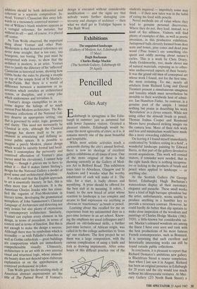
One glance at the model, showing a confused building with varied façades and the Corinthian order of the original build- ing dissolving into banality as it turned the corner to Pall Mall East, revealed the terrible truth: that Venturi's response to this dauntingly conspicuous commission was to be elaborately clever and perverse. He had met the principal requirements of the site — to respond to Wilkins's Classic- ism and to continue the line of the north side of Pall Mall — but he had done so in a way that was primarily intended to confirm his reputation as avant-garde and an ori- ginal artist. Unfortunately, the result is not just contrived and ugly but fails to be serious architecture.
Perhaps I should not have been sur- prised or disappointed. All of Venturi's buildings have been essentially expressions of particular ideas — reinterpretations of the Shingle Style or Lutyens's Classicism in his houses; self-conscious attempts at `con- textualism' in his other museum exten- sions. As Tom Wolfe noted in Bauhaus to Our House, 'At first glance, Venturi's words seemed rebellious. But his designs -never seemed anything other than timid.' Wolfe's assessment of Venturi is particu- larly relevant to the National Gallery design. His thesis was that modern architecture in the United States was the property of a 'compound' or elite of self-regarding, non-bourgeois intellectuals who preserved the true faith against popu- lar criticism. Venturi at first seemed to be a rebel but he was not, argued Wolfe, for he was not really interested in making architecture truly accessible to and respon- sive to the public — for what, then, would be the role of the interpreter, the intellec- tual? 'Studied closely, Venturi's treatise turns out to be not apostasy at all but rather an agile and brilliant skip along the top of the wall of the compound.'
The treatise in question was Complexity and Contradiction in Architecture, which was published in 1966 and which is the source of Venturi's fame and influence. The trouble seems to be that Venturi seems to feel obliged to create complexity and contradiction even when they are not required by context or plan. This is painful- ly evident in the National Gallery design. All other competitors that matter (I cannot now recall all of the schemes submitted in the first, botched competition) recognised that the plan of any building put on the Hampton site must continue the axial rectilinear geometry of William Wilkins's original Neo-Classical National Gallery building. The only other axis that matters is the angled approach of Pall Mall. This can either be ignored or, better, reconciled with the grid, perhaps by an intervening curved wall.
Venturi, however, perversely chooses to adopt a grid for his galleries which does not correspond with that in the original build- ing. He justifies this skewed effect by the irregular boundaries of the site. In fact, Venturi's plan does not correspond with the alignment of any of the street lines and where it collides with his Trafalgar Square frontage, spaces of distressingly messy shape result. The only justification for this skew would seem to be that it makes the grand staircase from the new main ent- rance on the ground floor taper as it rises. One wall of this is to be of glass, affording views of Wilkins's elevations and of `Jubilee Walk', the public right of way which runs between the two buildings under a connecting bridge; the other wall is to be of stone, carved with the names of Renaissance artists in Roman capitals, while the wall at the top of the staircase is reserved for an inscription celebrating the generosity of the building's donors.
I fail to see the point of this tapering staircase. It can be compared with the Scala Regia at the Vatican, except that the false-perspective effect will work in re- verse. The point seems to be that Venturi likes not only to drop historical references but also to create difficulties so that he can show his cleverness by getting out of them. The discordance between the grain of the Wilkins galleries and that of Venturi's plan is reconciled by another false-perspective effect, for the axial vista from the old building will be terminated by a series of arches of diminishing size cut through Venturi's skew walls. All very clever and learned — but redundant if a more logical plan had to be adopted in the first place.
The design is, in short, full of good ideas but they are not integrated into an overall coherent composition. The staircase does not connect satisfactorily with the ground floor lobby, which is a completely incohe- rent space, contained by no formal geometry. There are arbitrary concave recesses — references to the Baroque, se& — and a colonnade whose axis suddenly bends, for no structural or visual reason that I can detect on plan. It is all the work of a man who knows his history but who cannot learn from history. The galleries are inspired by Soane's at Dulwich; the stair- case is reminiscent of Lutyens's at Castle Drogo; there are references to Bernini, Borromini, Labrouste and other fashion- able precedents. But there seems to be nothing particularly characteristic of Ven- turi except affectation — and incoherence.
The gallery interiors might work. What is worst about the design is the exterior. This matters: after all, it was the insensitiv- ity of the earlier design to its crucial context which provoked the Prince of Wales's 'carbuncle' reference. Most of the external elevations consist of bleak and featureless walls which could have been designed by any hack modern architect Venturi calls the façade that will face north towards Leicester Square 'a strong and reticent wall', failing to mention vast ven- tilation grilles. It is towards Trafalgar Square that a conscious effort has been made. Here an elevation has been de- signed which is conceived 'both as a cadenza and coda' to Wilkins's building. Pilasters and columns from Wilkins's order are applied arbitrarily to a façade which lurches in a series of planes around to Pall Mall East, with recessions that only work in one direction. The whole façade is therefore asymmetrical, comprehensible only as an extension, although a good addition should be both deferential and coherent as a separate composition. In- stead, Venturi's Classicism dies away left- wards in a tiresomely contrived manner one of Wilkins's blank windows appears as a vestigial reference, for instance, but without its sill — and, of course, it is placed off centre.
As Torn Wolfe observed, the important thing about Venturi and other Post- Modernists is that historical references are never done straight; that is too easy, too bourgeois, too boring. The past must be interpreted with irony, to show that the architect is modem, is an artist. Venturi tries to justify the illiteracy of his `inflected' Classicism in historical terms, showing how Gibbs broke the rules by placing a steeple on top of the temple front of St Martin's- in-the-Fields. But there is a world of difference between a mannerism or in- novation which enriches an architectural system, or discipline, and a camp joke which undermines and trivialises it.
Venturi's design exemplifies to an ex- treme degree the failings of so much Current Post-Modern architecture. The Re- naissance collections of the National Gal- lery deserve an appropriate setting; one that is governed by order, logic, geometry and clarity. This need not necessarily be Classical in style, although the Classical language has shown itself to be pre- eminent in articulating and defining in- tenor public spaces. It is possible to Imagine a purely Modern, planar design which would be suitably formal and lucid. When I contemplate the perversity and contrived affectation of Venturi's plan (never mind his elevations), I cannot help feeling — though it grieves me to have to admit it — that it makes James Stirling's design for the National Gallery a model of good sense and architectural discipline.
It is often said that the English approach to art is essentially literary. In fact, this is often more true of Americans. It is the American Charles Jencks who has classi- fied the vagaries of Post-Modernism in literary terms, developing the grammatical metaphors of John Summerson's Classical Language of Architecture and detecting not only ironies but also plenty of oxymorons In contemporary architecture. Similarly, Venturi can explain every element in his design, in terms of precedent, in terms of Context and in terms of function. But this is not enough to make the design a success. Although there may be symbolism which is recondite — as with Palladio's churches as well as Gothic cathedrals — great buildings are compositions which are immediately Comprehensible visually. Ultimately, architecture is an art with its own internal visual and structural logic, whose immedi- ate beauty does not depend upon elaborate explanation or on the apprehension of contrived professional in-jokes. Tom Wolfe gave his devastating study of American abstract expressionist art the title of The Painted Word. If Venturi's design is executed without considerable modification — and the signs are that nobody wants further damaging con- troversy and changes of architect — then what we shall get in Trafalgar Square is The Built Word.


 Previous page