ARTS
Design
The uses of things
Tanya Harrod
Design, miruir du siecle (Grand Palais, Paris, till 25 July) Is Starck a Designer? (Design Museum, till 3 October)
Karl Marx was only incidentally a design historian but no other writer gives more vivid, intense accounts of modern `things'. No one has better described the ambience of a great textile mill or the mis- ery of a brick field or the enigmatic nature of commodities. `To discover the various uses of things is the work of history,' wrote Marx in the first volume and on the first page of Das Kapital. Discovering the vari- ous uses of things is, of course, the central task of the design historian and of design museums. It is a task — judging by two cur- rent shows in Paris and London — that the profession seems unable or unwilling to fulfil in a straightforward fashion.
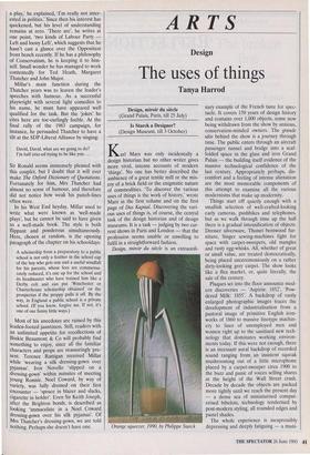
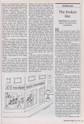
Design, miroir du siecle is an extraordi- Orange squeezer, 1990, by Philippe Starck nary example of the French taste for spec- tacle. It covers 150 years of design history and contains over 1,000 objects, some now being withdrawn from the show by anxious, conservation-minded owners. The grande idee behind the show is a journey through time. The public enters through an aircraft passenger tunnel and bridge into a scaf- folded space in the glass and iron Grand Palais — the building itself evidence of the massive technological confidence of the last century. Appropriately perhaps, dis- comfort and a feeling of intense alienation are the most memorable components of this attempt to examine all the various modernisms that make up modernity.
Things start off quietly enough with a smallish selection of well-crafted-looking early cameras, pushbikes and telephones, but as we walk through time up the hall there is a gradual intensification of objects. Dresser silverware, Thonet bentwood fur- niture, Singer sewing-machines fight for space with carpet-sweepers, old mangles and rusty egg-whisks. All, whether of great or small value, are treated democratically, being placed unceremoniously on a rather dirty-looking grey carpet. The show looks like a flea market, or, quite literally, the sale of the century.
Plaques set into the floor announce mod- ern discoveries — 'Aspirin: 1852', 'Pow- dered Milk: 1855'. A backdrop of vastly enlarged photographic images traces the development of industrialisation from a pastoral image of primitive English iron- works of 1860 to massive linotype machin- ery to lines of unemployed men and women right up to the sanitised new tech- nology that dominates working environ- ments today. If this were not enough, there is an incessant aural backdrop of recorded sound ranging from, an insistent squeak mushrooming out of a little microphone placed by a carpet-sweeper circa 1900 to the buzz and panic of voices selling shares at the height of the Wall Street crash. Decade by decade the objects are packed more tightly until we reach the present day — a dense sea of miniaturised comput- erised bibelots, technology tenderised by post-modern styling, all rounded edges and pastel shades.
The whole experience is inexpressibly depressing and deeply fatiguing — a mani-
festo for de-industrialisation, designed to fill most visitors with a strong sense of mis- ery and loss. Like all design exhibitions that claim to be comprehensive there is one Important missing element — military hardware is excluded. Nonetheless, the show is full of sights and sounds of destruc- tion, of a massive industrial explosion that started destroying European folk culture at the beginning of the 19th century and that went on to undermine the arts and crafts of the rest of the world. Apparently many museum curators were horrified by this show, above all by the casual way in which `things' were jammed side by side and labelled in the baldest, briefest fashion. But I can think of no other exhibition that gives such a strong sense of the experience of being modern and which reminds one so forcibly that to be truly modern must always mean, at least in part, being anti- modern.
In Paris it is difficult to study individual objects because of the car-boot-sale design strategy. The Philippe Starck show at the Design Museum (Butler's Wharf, SEt) is alienating in a different way. It is hardly overcrowded but ludicrously inaccessible because everything is skied on ten-foot steel plinths. Small objects are made virtu- ally invisible, while tables and chairs can only be viewed from odd, unhelpful per- spectives. Visitors under 5'5" are at a disad- vantage.
What a lot of absurd hype surrounds Starck! The process has been aided by press coverage that is limited to the per- sonal interview and the preview and by the swoonily lit photographs of objects which when touched and handled turn out to be banal and flimsy in the extreme. In fact, to answer the question posed by the title of this show, Starck is not what I would call a
designer, but a clever, poetic stylist who plays with a number of seemingly resonant themes that work best as drawings. His absurd teapot and kettle probably started off life as pleasing sketches. Aloft on a plinth they still look hopeful, but handling them in the Design Museum shop reveals their fiddly failure as functioning objects.
Starck is nonetheless a talent — if unnervingly one for all seasons. My com- panion on this outing, for instance, argued for a dominant urban hunter-gatherer theme in his work, and indeed the lamp of an Anglepoise transmutes effortlessly into a Norse drinking horn, while a sculptural- looking stool suggested branches or bones lashed together. But equally there is Starck the rationalist designer of folding chairs, Starck the early modernist, whose chrome, steel and rubber prototype chairs are the best thing in the show, Art Deco Starck and even a hint of an Arts and Crafts Starck. The best of his designs, his chairs above all, suggest a great, unstoppable cre- ativity, but one born at an inauspicious time. Had he been at the Central School in the 1890s with W.R. Lethaby or at the Bauhaus with Walter Gropius, who knows what he might have produced. But, faithful to the confusion and frivolity of the Eight- ies and early Nineties, the results are patchy. The sense of waste is underlined by the absurd presentation of the work, aloft and swathed in a tent of white muslin as if hint- ing at a Plato's cave of ideal objects. In an odd sort of way these two exhibitions com- plement each other. At the Design Muse- um we see the object fetishised, In Paris where Starck's work jostles for space in the final section — the ephemerality of all but the most socially responsible designs is made alarmingly plain.


 Previous page