An irresistible invitation
Alan Powers boldly goes into the debate about the V&A's Boilerhouse extension
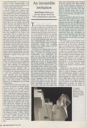
The call from the command spaceship came late at night but was irresistible. Next morning I was there early to be welcomed aboard by the smiling crew. Everybody was clustered round the model of the new mod- ule. It was certainly different to anything we'd seen before. A press breakfast for Daniel Libeskind's proposal for the Victo- ria and Albert Museum made space travel seem wonderfully close. This was no cau- tious, planner-friendly product of English architectural culture but something launched from another galaxy to put the earthlings in disarray.
Just when it was looking safe to go back into architectural orbit (which is to say, when a consensus was emerging between `traditionalists' and 'modernists), the paper over the cracks has split and the ground has shifted. There were broadly two reactions to the first publications of the angular pile of boxes in the gap between the museum buildings on Exhibition Road. One was shock and conspiracy theory — no such design could be without some sinister ulterior motive, the most immediate being that it would disguise the announcement of the V&A introducing admission charges. The second was that Alan Borg, the new director, was doing it for personal publicity. Then came the counter-charge in the archi- tectural magazines, which declared that, whether they liked it or not, they were going to the death for it because the oppo- sition (identifiable by their three-piece tweed space suits) were the people they hated most. Subsequently, more balanced views have emerged, from Simon Jenkins in the Evening Standard, approving the panache of the proposal but asking for a reduction of scale, and from Clare Mel- huish in Building Design who sees the design as `the result of reinventing architec- ture as, in the first place, an abstract intel- lectual process'.
What is surprising is that such an impos- sible-looking object could work on a func- tional level. The V&A say that, of the architects interviewed from thr shortlist, Libeskind was the only one who had read and understood the brief for the building, which is the now-familiar mixture of shop and café, display areas and 'orientation', for which purpose visitors can ascend to a cantilevered glass pod overhanging the main museum courtyard in the hope (opti- mistic, I fear) that thereafter they will understand how to find their way around the museum.
The strong point of the building will be its interior, while attention has inevitably focused so far on the exterior. Libeskind's plan, an ascending spiral centred on a lift- shaft core, is not the crazy collision which its external surfaces suggest. The building is really a tree, an impression confirmed by the blue and yellow tile surfaces relating to the surrounding Victorian buildings, unsen- timental and mustardy London colours. For a wicked moment it even seemed to resemble the Faraway Tree described by Enid Blyton, a set of vertical apartments inhabited by unearthly creatures which remains in my memory as a good model for a vertical city.
Compared to a tree, however, the cubist forms are rather crude for such a big scale. There is a gap in technique, common to other deconstructivist architects, between the desire to make buildings completely unlike anything seen before and the reali- ties of engineering, weather and technical servicing that can turn original ideas into mere eccentricity. As with Hans Scharoun's Philharmonie in Berlin, the process of designing a building from the inside out Conceptual model for the Boilerhouse at the Victoria and Albert Museum by Daniel Libeskind can result in a lumpy rucksack rather than a well-packed suitcase.
Not that the exterior is lacking in sym- bolic function. Libeskind's building is call- ing across the street to the crowds entering the Science Museum that it too has lots of fun to offer. Whether this parade sauvage can deliver what it promises, and whether we want it to, is another matter. It objecti- fies the V&A's problems of self-image in conscious and ingenious ugliness and it is traditional in the sense that the whole V&A site represents nearly 150 years of confusion about the role of the decorative arts and the use of architecture to house them. It is Exhibition Road, a six-lane epis- temological division between the arts and sciences, that has impoverished both and is the real seat of the problem which decon- structivist architecture claims to address. The solution might not be to fill this obvi- ously inadequate gap in the V&A site but to strike boldly out across the road.
The V&A proposal could be considered a one-off collector's trophy for the national Museum of objects rather than a picture of the future. The idea that supermarkets will want to look like this in ten years' time is as terrifying as being taken over by Martians or triffids, but, if the debate achieves a replacement of the tired duality of tradi- tional and modern with a discussion about what architecture can do beyond its famil- iar limits, then the V&A is a good place to launch it.


 Previous page