ARTS
Signs of the times
Stephen Bayley on the influence and aesthetic qualities of posters
Milton Glaser, who founded New York's Push Pin Studio in 1954, is one of the great poster designers of recent years. He quite correctly realised that the power and influence of commercial art (graphic design) threatened the established visual hierarchy which had painting at the top and mere 'illustration' at the bottom. He got around this critical conundrum with the clever formulation that 'we should replace the word "art" with the word "work" '. That's a gloss on the entire century.
When it comes to getting the attention of the public, old-fashioned painting has been continuously under threat from modern media, something Walter Benjamin noticed as early as 1936 when he wrote his famous essay 'The Work of Art in the Age of Mechanical Reproduction' (in which he questioned whether the true value of a pic- ture lay in its reproducible image or in its unique physical form). This is not to say that there are no great painters today, only that more lively opportunities for visual communications exist than the arrange- ment of pigment on canvas. Painting has become a relic: precious, revered, but a thing of the past. The spirit of art is fugitive and nowadays takes refuge in different media. Like the poster.
In many respects advertising has assumed the role of popular art. That this presents a crisis for fine artists is fully demonstrated by the vapid and pretentious nonsense practised by most (but not all) conceptual and performance artists. If you strip away from art the assumption that it should communicate visually, then there's not really a great deal left. While it may challenge with its effrontery, a remarkable Proportion of contemporary gallery art has no aesthetic content. Unlike the poster.
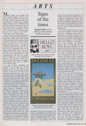
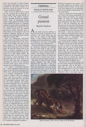
The advertising poster — whether for a Paris cabaret, War Bonds, the Health Edu- cation Council or Wonderbra — is a paradigm of modern art in its truest sense. It is a perfect expression of that uniquely 20th-century phenomenon which puts the fruits of technology into service as the materials of expression. Granted, the exal- tation factor may be lower when you com- pare Fra Angelico of Fiesole at work on behalf of the Holy Ghost to Barrie Spiv of Wardour Street at work on behalf of panty liners, but artists have always gone where the money is. Today there is no market for Annunciations, but there is for sanitary tow- els. Even John Ruskin noticed: he wrote from Florence saying that the age of the bill-poster had succeeded the age of Giotto. But this is not to say that advertising is art, only that it has something in common With traditional notions of it and has usurped many of its functions. This has its TBWA's 'Hello, Boys. The One and Only Wonderbra, 1994, for Playtex `Skegness is SO Bracing, John Hassall. First published in 1908 by GNR discomforts: for anyone who believes that visual art is fundamental to civilisation, the venal crudity of the advertising profession would be dismaying. Nick Welch, son of Colin, late of the Telegraph, is the creative director of a big London agency. He describes his professional community as a `mixture of posh pirates and barrow boys', a nightmare collaboration between well- brought-up individuals who cannot resist the temptation towards organised lying (or what George Orwell described as 'the rattle of a stick in a swill bucket') and gifted yob- boes who chose art school rather than the building trade.
Nor can advertising art always be subject to the auteur principle of creativity which governs our assumptions about aesthetics: advertising is a collective activity, not an individual one (although you might be mis- taken if you witnessed the tribal displays of mutual back-slapping at annual industry awards when authorship is rewarded ... and, in turn, disputed: the argument between who was responsible for the immortal 'Hello, Boys' Wonderbra ad was conducted with all the scratchy ferocity of a classic academic dispute). But, most signifi- cantly of all, advertising differs from fine art in that its product (the poster, the video) is intrinsically worthless, or, at least, worth no more than the paper it is printed on or the tape which recorded it. And here, paradoxically, lies its artistic value. The poster is mass-produced art and therefore has to accommodate itself to the severe poetics of mass production: a sound idea, produced in high volume to a uniform design and available at low cost, but capa- ble of huge commercial influence. Its value is in the strength of its image.
Still, when it comes to the role of aes- thetics in everyday life, the advertising poster has few rivals. If you can get that image right you are in possession of some- thing very remarkable. In a way which the cardinals who attended the Council of Trent would have recognised, the poster speaks to people, provides a (maybe queasy) version of moral and aesthetic guidance, communicates persuasively and, given the vast aggregates involved, very cost-effectively.
The Power of the Poster exhibition at the Victoria & Albert Museum (until 26 July) is, if you ignore the startling (and free) liv- ing poster shows of Vauxhall Cross and the Great West Road, the most complete exhi- bition of its sort in London since the influ- ential Smithsonian Images of an Era, the American Poster 1945-1975 seen at the ICA in 1976. Organised by the Museum's Mar- garet Timms (who also edited the cata- logue), The Power of the Poster is a presentation of some classics from the fab- ulous collections of the Department of Prints and Drawings. The exhibition is a rare treat since the bureaucracy and mechanics of retrieving the originals (all 200 and more of them), theoretically avail- able to any researcher or curious member of the public, would make access to such a collection for the private scrutiny of an individual beyond the patience of all but the most fanatical of students.
While it does not isolate them in exactly this way, it presents the five great ages of poster design. First, the great Parisian art posters of the 19th century: Toulouse- Lautrec, Theophile Steinlein and Alphonse Mucha. These are hypnotically familiar images of great graphic inventiveness which helped establish the poster as a legitimate medium for serious artists, something which their memorability has reinforced. Second, the 'political' poster from the muscular homo-erotic national Romantic style of Peter Behrens in his designs for the 1914 Werkbund exhibition, through the Soviet agitprop of the Stenberg Brothers via China and Cuba to Prague, 1989.
Third, the distinctively mid-century British school of the Public Service Poster: Fougasse and Abram Games in the service of the Great Utilities, the latter the last great exponent of the drawn lithograph before poster design moved into its fourth phase, the Pop and Theatre work of the Sixties, a glorious compilation of West Coast style and dope-inspired London imi- tations of it. Here Martin Sharp's 'Mr Tambourine Man' of 1967 is as evocative and accurate a visual description of the gorgeously daft tenor of the times as you will ever find. And, fifth, contemporary advertising: the world of Levis, Benetton and Nike, smart, clever, catchy and witty, showing now on a billboard near you.
It is a superb — if somewhat conserva- tive — survey, inevitably constrained by the balance of the V&A's own collections. One Milton Glaser and five by Frank Brangwyn is an eccentric interpretation of their respective influence. Since the exhibition can be read, also, as a gloss on graphic design, more might have been said about the technological processes which domi- nate the creative repertoire. The installa- tion itself is handsome, but in its polite and sanitised presentation tough images are robbed of their magic and power: a chaste museum environment detoxes potent postures, the preciousness of imme- diacy has been lost. And so has the swag- gering arrogance of the poster's intrinsic worthlessness, the very thing that empow- ers it and gives astonishing authority to images on 48 sheet sites all over the world. Under glass in the calm of a great museum, posters seem less powerful. At Vauxhall Cross or on Talgarth Road, they stop traf- fic. Still, this is the interesting paradox which occurs when mass production meets a museum. This, after all, is what the V&A was founded for. The Power of the Poster is a classic V&A exhibition in that, like its founders, it senses the spirit of a century when image has attained greater philo- sophical and economic value than sub- stance. It is a stirring reminder that, while art is memory, propaganda is prophecy.


 Previous page