Design
Overwrought Chippendale
By KENNETH J. ROBINSON
THE Earls Court Furniture Exhibition is a frightening affair. Every January more than 200 British manufacturers get together and show how they make trends and influence people. At least I suppose they influence people. Somebody must buy the zany-looking products of the small firms we never seem to hear about at any other time, or they wouldn't turn up again each year looking so cheerful. But looking cheerful is, I imagine, part of the act of a firm that has decided to call itself—as so many do—something noble like Goody Dovetail Ltd. or Yebbersley-Vain- wallace, Henry and Sons (Indispensable Furni- ture) Ltd. As a matter of -fr01 t they all have some- thing to be cheerful abo■il at the moment, because
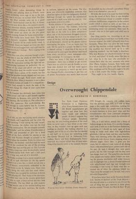
'Veux-tu bien laisser Madame Dusac tranquille.' 1959 brought the industry £10 million more than the previous year. Still, as I said in these pages a few weeks ago, statisticians working for the industry believe that people won't be buying so much furniture in three years' time, and that manufacturers who want continued prosperity must `make new furniture match the attraction of a new car.
This, as I said before, sounds like a threat of fashion design in the home. It's a terrible thought, and I took it with me to the Furniture Exhibition, wondering if I should see early signs of firms trying to outdo each other with high-fashion gimmicks. I did see them', and they were horrible. There were dressing tables like pink dovecotes, sideboards with drawer fronts slopping about at different angles ('Joe's idea : it gives you less room, but it's different') and, worst of all, dining chairs with -streamlined gravy gutters each side of the seat. At least I thought they were gravy gutters, but the sales manager told me they were 'just design, that's all.' The same firm also showed some pseudo-neo-Italian pieces (others are mak- ing the genuine neo-ltalian 'stuff under licence), and its highlight was a plastic-fronted sideboard with satin-finished ' steel legs and wrought-iron trimmings. I was trying to think what this re- minded me of when the salesman helped me. 'Take away the wrought iron;' he said, 'and you're left with Chippendale.'
If you have never been to the Furniture Exhibi- tion—known to habitues as the Trade Bizarre— this may all come as a surprise to you. It's not the sort of thing that gets reported in those glossy articles entitled 'Trends Are Here to Stay.' If you rely for your information t the press, you end up with no more than a few catch-phrases about the Long Low Line, Orthopaedic Sitting in the Sixties and the Contemporary Teak (Con-Teaky?) Look. Only by actually going to the Exhibition can you hope to know that the ebonised leg with brass spats is now being trimmed with brass lace, that you can still furnish with Ye Olde Kitchen Dresser and/or Church Pew and that the latest high chair has a gilt lining. Only by slogging round the stands of some 200 firms do you get a fair impression of the present state of. furniture design.
What is that impression? A top designer (they call him Gyro) told me that this year's exhibits are 60 per cent. bad, 30 per cent. tolerable and 10 per cent. derivative. The last part of that sum- ming up is a nasty crack : perhaps it's deserved, but it really is very difficult to trace the origins of any shape (a Professor of the Royal College of Art has just been doing some interesting research on the subject), so it might be kinder to let the 10 per cent. through as good designs. It's the '30 per cent. tolerable' that interests me. I think it's a fair estimate and it's certainly encouraging : the figure would not have been nearly so high five years ago. It seems that a lot of firms are anxious to clean up their designs—to remove the gold leaf and the bulbous projections, and to imitate better products. But imitation is as far as most of them get, and not very good imitation at that. Few of them use qualified designers. Neverthe- less, as so Many arc imitating the better Stuff, there's a chance that one day the penny will drop and they will get a professional design job done on their •products. But. cl,..*Ibt if this will happen until they' find that good design sells better than bad design. And it does—sometimes. I saw two firms at the exhibition who were hiding their mock-antiques (one time best-sellers) at the back of their stands, behind new, modern furniture which is well made, good to look at and popular.
There is quite a lot of furniture of this quality on the central stand, which was ingeniously designed by Stefan Buzas to display pieces selected from other parts of the exhibition by the Council of Industrial Design. This stand is very useful for visitors who want a quick guide to some of the best furniture makers. Those with more time on their hands can enrich their lives with a belly- laugh at much of the rubbish that is passed off as furniture, and a visit to two amusing non-com- mercial displays. One is a series of 'budget room settings' by well-known designers. My favourite is Lady Casson's, in which subtle colours and lighting effects give an underwater look (Picard- esque is the word I want for this essay in aquaceous living). The other display throws together modern painting, sculpture and furniture. I enjoyed this hotch-potch of Hepworth, bent wire, Picasso and moulded plastics (arranged by Brian Robertson of the Whitechapel Art Gallery) and hoped it had no Message. It was designed by the Design Research Unit, who also worked with Misha Black on the framework of the whole exhibition. This, by the way, is extremely elegant and I was frequently grateful for something to relieve my mind from the horrors of Jacobean with a new twist or contemporary with a capital 'C.' It was rather like seeing the Royal Academy's Summer Exhibition mounted in Lloyd Wright's Guggen- heim Museum.


 Previous page