


`Cheesecake and raspberry tarts'
was a contemporary description of a Robert Adam colour scheme. Annabel Ricketts investigates The recent re-opening of the domed salon at Chiswick completes a series of three entrance halls around London that have been redecorated by English Heritage to the highest possible standard of histori- cal accuracy. Together these rooms form a group that cannot be ignored; not only is English Heritage causing us to readjust our ideas about 18th-century interiors — in two cases the colour schemes revealed are far from conventional — but they are also set- ting the standard against which all similar projects should now be judged.
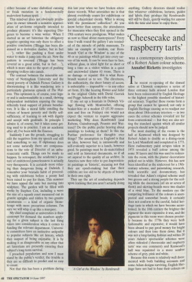
The most dazzling of the rooms is the hall at Kenwood which was designed by Robert Adam to double as a dining-room for Lord Mansfield and completed in 1773. Here rudimentary paint scrapes taken in 1973 revealed a buff colour among the some 30 layers and this was used to redeco- rate the room, with the plaster decorations picked out in white. However, this has now been identified as the undercoat for a 19th- century scheme, and painstaking research, both scientific and documentary, has revealed that Adam's original scheme used two greens and a strong purple for the ceil- ing while the doorcases (all six or seven of them) and skirting-boards were two shades of a vivid blue. To the modern eye the competing brilliance of the colours is unex- pected and somewhat brash; it certainly does not conform to the careful, faded her- itage taste to which we have become accus- tomed. In the 18th century the brighter the pigment the more expensive it was, and the pigments in this room were chosen precise- ly because in the 1770s they were both fashionable and expensive; it would have been absurd to pay good money for bright colours and then tone them down. But it was not a long-lasting fashion and within 20 years Adam's spectacular schemes were often ridiculed (`cheesecake and raspberry tarts' was one comment) and Kenwood's hall was repainted in a more sombre scheme of grey, pink and white.
Because this room is relatively well docu- mented with both building accounts and some Adam designs surviving, English Her- itage have not had to base their colours on Entrance Hall at Kenwood scientific analysis alone. This, plus their determination to use wherever possible the exact materials available at the time including lead-based paints which are banned both in the United States and the EU (another, less well-known British opt- out) — means that what is now seen here is arguably as close as it is possible to get to the way a newly decorated Adam room would look. One example demonstrates the thoroughness of English Heritage's approach. A bill for ceiling painting speci- fied (among other colours) purple and this was also confirmed by the enhancement of previously indecipherable pencilled notes on Adam's ceiling design. However, paint analysis showed that the relevant layer was unmistakably dark blue. Subsequent exami- nation of the pigments at this level revealed not only Prussian Blue but also Red Lake, a colour known to be suscepti- ble to fading. When English Heritage mixed this combination the result was the rich purple used as the background to some of the mouldings.
The other two halls are some 50 years earlier than Kenwood. Chiswick, Lord Burlington's 1720s manifesto of Palladian ideas has the most conventional colour scheme of the three. The room was last redecorated in the 1950s when the idea of using paint scrapes to reveal original colours was in its infancy. Legend has it that gentle rubbing with the edge of a coin revealed the startlingly harsh band of mus- tard yellow all around the room between the dome and the walls. Today cross sec- tions of paint layers are mounted in resin and examined under a microscope and this has shown the only yellow used was an undercoat. In fact the scheme was — and is — extremely simple with no gilding or colour enrichment of any kind. The creamy white dome, its height accentuated by the perspective of its coffering, rises magnifi- cently over pale grey walls reaching a total height of some 60 feet, an amazing space in so small a house.
Marble Hill, contemporary with Chiswick, is a more domestic Thames-side villa near Richmond built for George H's mistress Henrietta Howard. Here paint analysis in the hall has revealed a more complex approach. Only the ceiling is white, while the beams and walls have a definite green tinge which contrasts with the warm honey colour of the woodwork of the shut- ters, skirting-boards and door frames. The doors themselves are a glistening oily deep brown while the stone columns, originally unpainted, are now the only feature which it has not been possible to return to its orig- inal state and they have therefore been painted a stone colour. So strong is the expectation that these rather architectural halls were decorated in the whites and greys seen at Chiswick that, although none of the colours used here is particularly strident, the effect is startling and unexpected.
Helen Hughes, English Heritage's archi- tectural paint researcher who was responsi- ble for Kenwood, and Ian Bristow, who worked on the other schemes, have pro- duced an impressive and convincing demonstration of what can be achieved using scientific research backed by docu- mentary research. They have also chal- lenged preconceived ideas about 18th-century tastes since, especially at Ken- wood and Marble Hill, the new schemes come as a surprise. Do go to see these rooms. Whether or not you like them, English Heritage's approach is surely bet- ter and more stimulating than opting for a somewhat arbitrary use of safe 'heritage' colours with quaint names. Detailed and accurate reconstructions like these should be appreciated and valued.
Ian Bristow's books Architectural Colour in British Interiors 1615-1840 and Interior House-painting Colours and Technology 1615-1840 were published last year by Yale.