


Exhibitions
Ellsworth Kelly (Tate Gallery, till 7 September)
A free spirit
Martin Gayford
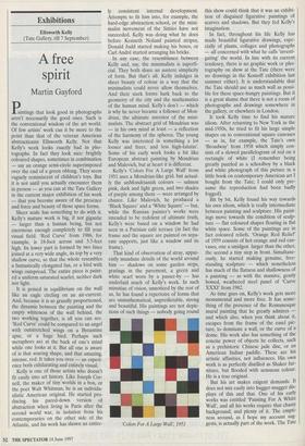
Paintings that look good in photographs aren't necessarily the good ones. Such is the conventional wisdom of the art world. Of few artists' work can it be more to the point than that of the veteran American abstractionist Ellsworth Kelly. Not that Kelly's work looks exactly bad in pho- tographs. In fact they look nice: brightly coloured shapes, sometimes in combination — say an orange semi-circle superimposed over the end of a green oblong. They seem vaguely reminiscent of children's toys. But it is not until you actually encounter them in person — as you can at the Tate Gallery in the current major exhibition of his work — that you become aware of the presence and force and beauty of those spare forms. Sheer scale has something to do with it. Kelly's mature work is big, if not gigantic — larger than a human being, but not enormous enough completely to fill your visual field. 'Red Curve' from 1986, for example, is 18-foot across and 3.5-feet high. Its lower part is formed by two lines joined at a very wide angle, its top by a very shallow curve, so that the whole resembles a fantastically elongated fan, or a bird with wings outspread. The entire piece is paint- ed a uniform saturated scarlet, neither dark nor light.
It is poised in equilibrium on the wall like an eagle circling on an air-current. And, because it is so grandly proportioned, the dynamic between the painting and the empty whiteness of the wall behind, the two working together, is all you can see. `Red Curve' could be compared to an angel with outstretched wings on a Byzantine apse, or a huge bird. Perhaps such metaphors are at the back of one's mind while one looks at it. But all one is aware of is that soaring shape, and that amazing, intense, red. It takes you over — an experi- ence both exhilarating and entirely visual.
Kelly is one of those artists who doesn't fit easily into art history. Like Joseph Cor- nell, the maker of tiny worlds in a box, or the poet Walt Whitman, he is an individu- alistic American original. He started pro- ducing his pared-down version of abstraction when living in Paris after the second world war, in isolation from his contemporaries on the other side of the Atlantic, and his work has shown an entire- ly consistent internal development. Attempts to fit him into, for example, the hard-edge abstraction school, or the mini- malist movement of the Sixties have not succeeded. Kelly was doing what he does before Kenneth Noland painted stripes, Donald Judd started making his boxes, or Carl Andre started arranging his bricks.
In any case, the resemblance between Kelly and, say, the minimalists is superfi- cial. They both share an austere simplicity of form. But that's all. Kelly indulges in sheer beauty of colour in a way that the minimalists could never allow themselves. And their stark forms hark back to the geometry of the city and the mathematics of the human mind. Kelly's don't — which is why he never became a follower of Mon- drian, the ultimate ancestor of the mini- malists. The abstract grid of Mondrian was — in his own mind at least — a reflection of the harmony of the spheres. The young Kelly was interested in something a lot looser and freer, and less high-falutin'. Some of his early work looks a bit like European abstract painting by Mondrian and Malevich, but at heart it is different.
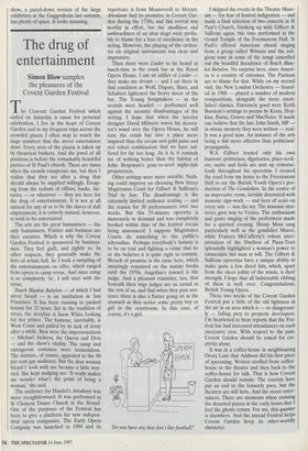
Kelly's 'Colors For A Large Wall' from 1951 uses a Mondrian-like grid, but actual- ly the unMondrianish colours — salmon pink, dark and light green, and two shades of purple among them — were arranged by chance. Like Malevich, he produced a `Black Square' and a 'White Square' — but, while the Russian painter's works were intended to be redolent of ultimate truth, Kelly's were based on a window he had seen in a Parisian café terrace (in fact the frame and the square are painted on sepa- rate supports, just like a window and its frame).
That kind of observation of stray, appar- ently mundane details of the world around him — shadows on some garden steps, gratings in the pavement, a green and white scarf worn by a passer-by — has underlaid much of Kelly's work. In such minutiae of vision, unnoticed by the rest of us, he has found a repertoire of forms that are unmathematical, unpredictable, strong and beautiful. His paintings are not depic- tions of such things — nobody going round `Colors For A Large Wall, 1951 this show could think that it was an exhibi- tion of disguised figurative paintings of scarves and shadows. But they fed Kelly's imagination.
In fact, throughout his life Kelly has made beautiful figurative drawings, espe- cially of plants, collages and photographs — all concerned with what he calls 'investi- gating' the world. In line with its current tendency, there is no graphic work or pho- tography on show at the Tate (there were no drawings in the Kossoff exhibition last summer either). It is understandable that the Tate should use as much wall as possi- ble for these space-hungry paintings. But it is a great shame that there is not a room of photographs and drawings somewhere in the gallery, or elsewhere in London.
It took Kelly time to find his mature idiom. After returning to New York in the mid-1950s, he tried to fit his large simple shapes on to conventional square canvases — as in, for example, the Tate's own `Broadway' from 1958 which simply con- sists of a stewed parallelogram of red on a rectangle of white (I remember being greatly puzzled as a schoolboy by a black and white photograph of this picture in a little book on contemporary American art I bought from the Tate; I could only pre- sume the reproduction had been badly fogged).
Bit by bit, Kelly found his way towards his own idiom, which is really intermediate between painting and sculpture. His paint- ings move towards the condition of sculp- ture — flat coloured shapes floating in flat white space. Some of the paintings are in fact coloured reliefs. 'Orange Red Relief' of 1959 consists of hot orange and red can- vases, one a smidgen larger than the other, the second a tiny step in front. Simultane- ously, he started making genuine, free- standing sculpture — which nonetheless has much of the flatness and shallowness of a painting — as with the massive, gently bowed, weathered steel panel of 'Curve XXXI' from 1982.
As time goes on, Kelly's work gets more monumental and more free. It has some- thing of the presence of the Romanesque mural painting that he greatly admires and which also, when you think about it, escapes from the frame of the easel pic- ture, to dominate a wall, or the curve of a dome. His work also has something of the concise power of objects he collects, such as a prehistoric Chinese jade disc, or an American Indian paddle. These are his artistic affinities, not influences. His own work is as perfectly distilled as Shaker fur- niture, but flooded with sensuous colour. He is a true original. But his art makes exigent demands. It does not mix easily into hugger-mugger dis- plays of this and that. One of his early works was entitled 'Painting For A White Wall', and all his works require that chaste background, and plenty of it. The empti- ness around, as I hope my account sug- gests, is actually part of the work. The Tate show, a pared-down version of the large exhibition at the Guggenheim last autumn, has plenty of space. It looks stunning.