Exhibitions 2
ABCDavid Kindersley, a life of letters (Kettle's Yard, Cambridge, till 25 June; Yorkshire Sculpture Park, Bretton Hall, 14 July-28 August)
Writing for pleasure
Alan Powers
the lettercutter David Kindersley was an inspiration to many people, inside and beyond his own particular art. He died in 1995 after a career of nearly 60 years, and his workshop in Cambridge continues under the extremely active leadership of his widow, Lida Lopes Cardozo, who came to work there in 1975.
Kindersley was always willing to acknowledge the influence on him of Eric Gill, to whom he went as an apprentice in the 1930s. Gill's workshop practice influ- enced his own desire to combine tradition- al teaching with work, and contemporary Britain has more good lettercutters as a result than might otherwise be the case. His son Richard Kindersley, who has been working on his own since the 1960s, is a prime example. Gill trained other letterers, including Ralph Beyer (still active today) and Reynolds Stone, whose assistant and pupil Michael Harvey is one of the most versatile and original lettering designers now working, but nearly all those working today trace their origin back to Gill.
To meet David Kindersley, or any of the fellow practitioners mentioned above, was to understand that there is more to letter- ing than meets the unpractised eye. It is an epitome of craft, in that it is best when linked to a specific function and set of con- ditions, often involving a building, and has no need to make claims as high art. On the other hand, as Eric Gill observed in the 1930s, 'Among the Chinese, good writing is more highly honoured than painting is with us, as highly perhaps as we honour a suc- cessful contraption for boiling soap.' In other words, lettering is the way in to an alternative view of the world, and this scarcely concealed motive is evident as much in Kindersley as it was in Gill. The same claim can be made for the crafts as a whole, although they are still viewed by many as an anachronistic and self-indul- gent alternative to industrial production, or a form of art bizarrely associated with func- tion or interior decor.
The pleasure for the letterer is that most lettering is intended to be read, for infor- mation if not for aesthetic delight. You can creep up on the unsuspecting reader and, if your belief about lettering's transformative ability is correct, you can shift their mental gears by a few degrees so that they have had an aesthetic experience before they can resist it.
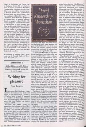
Kindersley's work ranged through many moods during his life. The exhibition, ABCDavid Kindersley, a life of letters, gives special attention to his work on the legibili- ty of street-name signs and motorway sig- nage. In the latter instance, his proposal that serifed capitals be adopted in prefer- ence to the upper and lower case sans serif designed in the 1960s by Jock Kinnear was rejected. The Kinnear signage continues in use and seems timeless, while Kindersley's rational alternative, while demonstrably functional in reducing the size of the signs, looks strangely awkward. His campaign for street-name signs began in 1947 when he saw the charming old cast-iron signs in Cambridge being taken down. Kindersley developed an alternative raised letter which he intended to have maximum legi- bility when viewed obliquely. He also developed a system for allowing non- experts to achieve the best optical spacing. Cambridge adopted his signs, and the Min' istry of Transport paid him £150 for use of the designs. An interactive computer pro- jection in the exhibition lets you test the different alternatives, while the excellent exhibition catalogue (£8.95) tells the story. This was a modest success in introducing beauty and order into the public realm, where it is more than ever needed today- The old Cambridge signs still seem to me to be the best, even if they take a split sec- ond longer to read, but ICindersleys designs showed the benefits of attending to quality in design. Since the spread of com- puters, lettering has become something that anyone can do badly. Computers can even cut gravestones, a trade which Kindersley felt secure in pursuing at least until people stopped dying. When Eric Gill and his teacher Edward Johnston first made lettering part of the Arts and Crafts movement in the first years of the 20th century, they opened people s eyes to something all around them but unseen, where convention and misplace' novelty, shaped by changing technologY, had destroyed what remained of an older, more innocent tradition. The big struggle to reform lettering was surprisingly success' ful, and the sense of public order which was evident in design for the Post Office, for example, now seems like evidence of a lost world of stability. Architects have the chance to set an example, and Kindersley carried out many site-specific commissions, although the best-known, for the new British LibrarY, seems to me one of the least successfulJ12 Great Russell Street, as part of the rebuild- ing ing of the British Museum, Lord (Norma) Foster recently invited lettering proposal' from a number of distinguished designers including Michael Harvey, but these have sadly been rejected in favour of a typo „ graphic system invariably used in his isor': On the other hand, at the National Muse um of Scotland, the lettering of donors.: names by Richard Kindersley, carved on stone screen wall by the entrance and all brass strips in the floor, is one of the n?.4:60. memorable features of the building' People's eyes zoom in on lettering w" they need information in a public plan Good lettering does not have to be. do. 01; and some of Kindersley's later commissions had a baroque exuberance, but it. lice"„ a well judged sense of the approPriate4e` can then lift the spirits to a remark° extent.


 Previous page