Visual agility
John McEwen
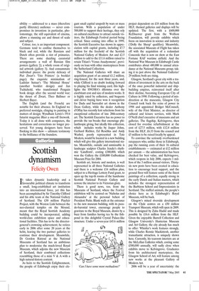
Avant-Garde Graphics 1918–1934 Estorick Collection of Modern Italian Art, 39a Canonbury Square, N1, until 5 June, and touring
It is difficult to place oneself in the position of the pioneers of graphic art shown at the Estorick Collection: their extraordinary leaps of the imagination have become the standard vocabulary; the shift from old to new they represent now distant history.
Born in the 19th century when 90 per cent of human understanding came through the naked eye, as adults they were confronted with a reality which was becoming the invisible reverse. Means of communication and commerce had been transformed beyond the scope of normal looking and common intelligence.
Nothing was more spectacular in its effect than electricity, as some of these designs proclaim. This new engine of industry and mass communication turned night into day and transformed and consolidated urbanisation. Gaslight may have calmed neighbourhood nerves, but electric light brought the whole city to throbbing life.
Yet how was this new dynamism, this mind-blowing complexity, to be visually conveyed? That was the artistic challenge and graphic art was the answer — a logical extension of avant-garde activity into mass communication. As the renowned designer of the catalogue, Richard Hollis, titles his essay: ‘Art + Technology = Design’. The inclusion of some pre-1920 magazines by the Italian futurists shows the first stirrings of using typography as a dynamic design element, emphasising the exhibition’s sympathetic connection with the Estorick’s permanent collection of futurist art. But graphic art as a visual language based on the modernist precepts of pure geometry and proportion arose, principally, through the field of creative tension which existed between artists in Holland, Germany and Russia. The Russian El Lissitzky was the chief emissary, a reminder that this art in itself was the product of a new ease in international communication.
The show is curated by Lutz Becker for the Hayward Gallery touring programme and the works have been selected from the fabulous private collection of the Bostonborn Merrill C. Berman, now in his mid-60s. There are 150 posters and original designs, the mixture of the two enriching the aesthetic pleasure and demystifying the processes involved. Becker has purposely chosen many unique and previously unexhibited works. If some of them ring bells, it is only because they are famous from reproduction.
Graphic art is modernist and modernism is often assumed to be left-wing. Much of the work displayed is indeed communist and socialist propaganda (Join Our Struggle/ Vote Communist, etc.), but it represents the dream rather than the slavish reality; and the cut-off date of 1934 marks the banishment imposed by Stalin and Hitler. As a result, modernism subsequently reached its apogee through the support of corporate America. It is the art that prevails.
Becker has characterised the key component as ‘the architecture of the page’. Typography is used like building blocks, diagonals recall cranes and girders. There is also the legacy of the war — searchlight beams, guns, even, in the dislocation and repetition of type, the rat-a-tat-tat of machine-gun fire (futurist typography especially tried to reproduce the staccato of industrialisation).
The exhibition has a sympathetically architectural construction: the groundfloor galleries, devoted to the Germans (and Swiss) and the Russians, form the foundation for the more humorous, satirical and poetic flights of Schwitters, John Heartfield and the Dadaists, the Dutch, Belgians and others upstairs. In every gallery light levels have been raised to the permitted maximum for such easily faded objects. Light is crucial for the appreciation of the difference between original artwork and its reproduction, let alone lithographic and gravure printing — a nuance requiring a magnifying glass.
The result is an extraordinary demonstration of visual agility, its vitality undimmed and undated after almost a century; the inclusion of the original artwork demonstrating how scissors, paste and paint still ruled; how monumentality is a matter of scale, not size. The work’s acces sibility — addressed to a mass (therefore partly illiterate) audience — never compromises its invention: in particular, photomontage, the still equivalent of cinema, allows a stunning cut and thrust of scale and subject.
Colour, too, is an important component. Germans tend to confine themselves to black and red, while the Russians and Dutch often provide a riot of primaries. There are some dazzling curatorial arrangements: a wall of Russian film posters (gallery 2); a whole room of original artwork (gallery 3). And consummate individual pieces: the poetic delicacy of Piet Zwart’s ‘Trio Printers’ (a booklet page); the exquisite minimalism of Ladislav Sutnar’s ‘The Minimal House’ (another booklet design) and Jan Tschichold, who transformed Penguin book design after the second world war; the thrust of Zwart, Theo Ballmer or Herbert Bayer.
The English (and the French) are notable for their absence. In England we preferred nostalgia, clinging to painting in matters of design; Wyndham Lewis’s 1914 futurist magazine Blast a one-off firework. Today it is all done with computers, the hesitations and corrections no longer preserved. Yet young designers have been flocking to this show — ultimate testimony to the brilliance of the founders.


 Previous page