Comfortless aesthetic
Andrew Lambirth
Modernism: Designing a New World 1914–39 V&A, until 23 July Sponsored by Habitat The classic Modernist interior familiar to us all is a white cube, minimally furnished and adorned, the clean geometric lines of the architecture given prominence at the expense of fittings and fixtures. As the visitor steps into the V&A’s homage to Modernism, it’s at once clear that the design of the show will not mirror that aesthetic. This is a busy, multicoloured display, crammed with pictures and artefacts, full of red or blue arrows linking labels to exhibits, and vamped up with variant wall patterns. It’s big on visual excitement, not restraint. There are over 300 exhibits and more than 50 film clips to be seen, and at times it’s difficult to make sense of the rich array.
Yet the exhibition certainly starts well, with a beautiful 1916 Malevich painting, ‘Dynamic Suprematism’, borrowed from the Tate. Instantly we are on a high. This is well backed up by the strange charcoal and pencil drawings by Georgii Krutikov of a flying city, and the delicious black cross and circle teacup and saucer by Nikolai Suetin. But here and there throughout the exhibition are bleak notices of apology marking gaps in the display: ‘The arrival of this object has been delayed by customs procedure in Russia.’ Sabotage or red-tape? Perhaps the missing exhibits will soon appear.
I liked Erich Mendelsohn’s plaster model for his Einstein Tower (a recent cast from the 1920 original), like a submarine with its conning tower. The three ink drawings for it are altogether more sharklike and minatory. In this first section are all manner of wonders, including the inescapable Rietveld chair (he said: ‘Every chair seems to be a stylisation of an attitude to life’), Balla’s jazzy Futurist suit (the Futurists are perhaps the only Modernists to have a sense of humour, and even they were pretty serious), and Mondrian’s painting ‘Tableau 1 with Red, Black, Blue and Yellow’ (1921) from The Hague. The last looks marvellous in this context, and set for once against a blue wall. The advantages of this apparently chaotic hang begin to emerge more fully.
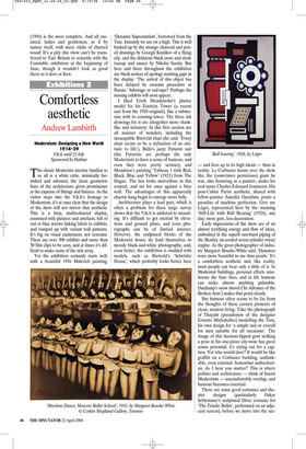
Architecture plays a lead part, which is often a problem for these large survey shows that the V&A is addicted to mounting. It’s difficult to get excited by elevations and ground plans, and even photographs can be of limited interest. However, the sculptural blocks of the Modernist house do lend themselves to moody black-and-white photography, and, even better, the exhibition is studded with models, such as Rietveld’s ‘Schröder House’, which probably looks better here — and lives up to its high ideals — than in reality. Le Corbusier looms over the show like the (sometimes pernicious) giant he was, also featuring as a painter, under his real name Charles-Edouard Jeanneret. His post-Cubist Purist aesthetic, shared with fellow-painter Amedée Ozenfant, posits a paradise of machine perfection. Give me Léger, represented here by the stunning ‘Still-Life with Ball Bearing’ (1926), any day; more guts, less decoration.
Early impressions of the show are of an almost terrifying energy and flow of ideas, embodied in the superb sun-burst piping of the Bentley air-cooled seven-cylinder rotary engine. As the great photographer of industry Margaret Bourke-White said, ‘Dynamos were more beautiful to me than pearls.’ It’s a comfortless aesthetic and, like reality, most people can bear only a little of it. In Modernist buildings, personal effects ameliorate the bare lines, and in life humour can make almost anything palatable. Duchamp’s snow shovel (‘In Advance of the Broken Arm’) makes that point clearly.
But humour often seems to be far from the thoughts of these earnest pioneers of clean, modern living. Take the photograph of Thayaht (pseudonym of the designer Ernesto Michahelles) modelling the Tuta, his own design for ‘a simple suit or overall for men suitable for all occasions’. The image of this luscious-lipped gent striking a pose in his one-piece city-wear has great comic potential: it’s crying out for a caption. Yet who would dare? It would be like graffiti on a Corbusier building, unthinkable, even criminal. Somewhat authoritarian, do I hear you mutter? This is where politics and architecture — think of fascist Modernism — uncomfortably overlap, and humour becomes essential.
There are some good costumes and theatre designs (particularly Oskar Schlemmer’s sculptural Diver costume for ‘The Triadic Ballet’, performed on an adjacent screen), before we move into the sec ond segment of this extensive exhibition. Here is one of the earliest fitted kitchens, rescued from a Frankfurt housing estate and restored after 80 years of continual use. Designed by the Austrian architect Margarete Schütte-Lihotzky, some 10,000 were made between 1925 and 1930 in three sizes to fit different flats. Painted in a warm shade of institutional green, it is laid out for maximum efficiency and hygiene, with everything possible (except a fridge, which wasn’t then a common appliance) within labour-saving reach. Our continuing obsession with fitted kitchens starts here.
There’s a whole section on chairs, from wood to tubular steel, starring some of the big names of Modernism such as Marcel Breuer (I like his nest of tables, but their different coloured tops sparked off the use of decorative colour that was to bedevil English architecture c.1951 and after), Alvar Aalto and Mies van der Rohe. A big Bauhaus display feature, all mirrors and metal scaffolding towers like a huge lighting gantry, reminds us that the exhibition is curated by Christopher Wilk, a Bauhaus specialist, and designed by Eva Jiricna, a highly lauded architect. Incidentally, the graphic design is by David Hillman of Pentagram, so I presume he is responsible for the near illegibility of printing black on blue for some of the labels.
There follow table lamps, pottery and glass, a wall of photos of key Modernist buildings (by architects including Wells Coates and Eileen Gray), then a section devoted to body culture, to sunbathing and gyms, to such machines as Ernst Pohl’s Omniscope X Ray apparatus and an ultraviolet sun-ray lamp. Here are Sonia Delaunay’s chic knitted wool swimming costume and Kandinsky’s remarkable geometric drawings of the dancer Gret Palucca. Another room deals with Modernism and nature, which would in itself make a fascinating exhibition, featuring such surrealist delights as Paul Nash’s ‘Monster Field’ photos, tree-root sculptures and a resonant Arp relief. Gabo is here, likewise a mock-rustic chair for Highpoint 2 by Lubetkin.
You need stamina for this exhibition. I’ve hardly breath left to praise the rare and splendid silvery streamlined dorsal-finned Czech Tatra T87, and Bertelli’s ‘Continuous Profile of Il Duce’. And I haven’t even mentioned Harry Beck’s first drawing for the London Underground map, a classic of Modernist design. The catalogue is a vast hardback tome of more than 400 pages and 360 colour plates. Even at £45 it’s an indispensable aide-memoire and guide to the exhibition, and a valuable reference book.
The whole show is an intensely secular hymn to a rational and more efficient life. But our souls need at least as much care as our bodies. It celebrates a reckless belief in technology which still endures, rather to the detriment of humanity, for we will never get on proper terms with the planet while we still try to dominate it through machines. The brave efforts towards Utopia showcased here may look somewhat naïve in the cynical context of today, when so much of what these pioneers invented is shamelessly (and often ignorantly) recycled. Yet Modernism’s myth endures, and, like hope, ‘springs eternal in the human breast’. This ambitious tribute to that spirit deserves to be a popular success.


 Previous page