ARTS
Hard boiled and half baked
Gavin Stamp
r-lood Design' is a most elusive 14-1 commodity. Artists and critics have worried about the appearance of everyday, utilitarian objects for almost two centuries and have proclaimed absolute principles in- tended to determine that a well-designed teapot, for instance, will be both functional and eternally beautiful. Yet such objects 'date' with remorseless inevitability and very few designs have managed to seem timelessly good — Wedgwood's Neo-Clas- sical pottery, perhaps, or Edward John- son's 1916 lettering for London Transport.
A. W. N. Pugin's belief that 'beauty is the fitness of the design for the purpose for which it was intended' has been used to justify stark functional design, yet he designed Gothic buildings and Gothic ink- wells. The style of these was disliked by Henry Cole, the campaigner for better designed 'art manufactures', who never- theless argued that 'ornament ... must be secondary to the thing decorated' — words which echo Pugin's. Cole looked to the Renaissance for well-designed ornament he was never in favour of absolute simplici- ty — but the types of design he encouraged were criticised by Ruskin and Morris, whose own writings inspired the rough honesty of the Arts and Crafts movement. Yet Morris, because he preached that 'I don't want art for a few, any more than education for a few, or freedom for a few', has been seen as a prophet of 20th-century industrial design, celebrated for leading the way along the heroic road towards Bauhaus austerity, by Nikolaus Pevsner in his im- mensely influential tract, Pioneers of Modern Design. A tubular steel chair may, logically, be the inevitable end product of cultural acceptance of machine production and the factory aesthetic yet, as we all know, it may not necessarily be comfor- table to sit in. We are concerned here not so much with absolute principles but with style and its changes; that is, fashion.
Which brings me to the Boiler House Project, a new design exhibition gallery at the Victoria and Albert Museum donated by Mr Terence Conran, the entrepreneur who founded the Habitat shops. Theore- tically, this is a suitable home for the enter- prise because a concern for good design was an important reason behind the establish- ment of the museum by Henry Cole in 1859. As is well known, many intelligent critics were horrified by the design of the manufactures shown at the Great Exhibi- tion in 1851. In contrast to the railway locomotives and guns — and to the strange beauty of the Crystal Palace itself — most objects seemed vulgar and over-elaborate in design. Even the government was worried and, in response to the High Seriousness of Prince Albert, the real founder of South Kensington, the existing government school of design was combined with a new museum whose purpose was didactic. The exhibits were chosen as models, both good and bad, for study and for emulation by students. The acceptance of 'fine art' by subsequent directors of the V&A has, therefore, deflected the museum from its original purpose, which was to help both artists and manufacturers.
The Boiler House may be dedicated to applied art and to industrial design, but I do not think Henry Cole would be very
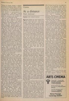
'Oh, he's the chap my husband ran the hoopla stall with.'
happy either with its appearance or its con- tents. It is certainly didactic, if lacking .in high seriousness, but is extraordinarily banal and — dare I say? — old fashioned in design, with no attention given to the prin- ciples of decoration and ornament which interested Cole and his contemporaries and which, pace. Walter Gropius, we still seem to crave. A new entrance to the V&A has been created off Exhibition Road by the Property Services Agency in the multi- storey-car-park style, with a raw, prefabricated concrete ceiling which col- lides with the decorative brick and terra- cotta of the Huxley building (itself being presently converted as a more important addition to the museum's facilities). Down below, on the site of the museum's old boiler house, Conran Associates have designed a gallery in which the walls and ceilings are white and the floor is of white tiles. As an operating theatre this space might be admirable, but the contrast With New York's museum of design, the Cooper' Hewitt mansion, is painful. In this chilling, clinical setting has been displayed the first exhibition (until 2 March): 'Art and Industry — a century of design in the products you use'. On white display stands are arranged such objects as a Mobil petrol pump, an Olivetti typewriter, a Gestetner duplicating machine, a Bissell carpet sweeper and a Toledo shop scale, which seem to have been chosen to celebrate a number of famous dustrial designers: Peter Behrens, Norman Bel Geddes, Raymond Loewe and Eliot Noyes, amongst others. The selection was made by Stephen Bayley, described as 'the Conran Foundation's dynamic young Director' in the (unsigned) foreward to the catalogue (incidentally, an appalling Piece of design, with confusing, tiring typography and one illustration printed upside-down). This catalogue is a remarkable document as it displays not a trace of the results of the revisionist design and art history of recent years but reiterates the standard Modern Movement functional line. With its talk of 'visionary' designers and how the V&A was 'the beginning of an attempt to establish rules for what manufactured objects should look like', it reads like an Open University tract. At the opening press conference (a ludi- crously trendy occasion, with Conran's girls dressed in white boiler suits and a lunch of a pork pie wrapped up in a house-style red spotted handerchief — no doubt Dr Sir Roy Strong would also have been in his boiler suit had he not been snowed up in .Herefordshire), it was an American wh°. asked why there was not a single example British design on display. The dynamic Director rather lamely replied that though there have been good British designers this century, the record of British industry to commissioning them was poor. This reallY will not do; that famous Modern Move- ment ikon, Wells Coates' Echo radio set could have been included, or the furniture of Gordon and R. D. Russell, or the design of seats, signs and stations for London
Transport by Charles Holden, a designer and architect of immense talent — approv- ed of by Pevsner. Possibly Holden is ruled out because he was not designing for com- petitive industry, for the Boiler House is ex- pressly devoted to mass-produced con- sumer products — and there is nothing essentially wrong with that as Henry Cole wanted his museum to be 'specially com- mercial, in so commercial an age'.
But the visitor might be forgiven for suspecting that the exhibition is not about design but about styling — the aesthetic Packaging of manufactured objects to pro- mote greater sales. Raymond Loewe, we gather, redesigned cigarette packets and streamlined fridges and sold millions more. That may be clever design but is it good design, and what are the 'rules' for design of industrial objects? Paradoxically, the catalogue tells us that 'there is nothing in- evitable about the appearance of manufac- tured objects. They didn't have to look this way.' Why do they then? The trouble is that the Boiler House manages to divorce style from function. In the context of the Science Museum on the opposite side of Exhibition Road, the appearance of a telephone, say, can be understood in relation to its evolving technology and its purpose. To put a tele- Phone on a pedestal and invite admiration Merely of its shape is to suggest it is a work of art, which it is not. An Olivetti typewriter with a streamlined case may, or may not, be beautiful, but there is no prac- tical, functional reason for it to be sheathed In rounded curves and its shape is irrelevant if it does not type efficiently. Fashions change: there are no 'rules' of design, providing an object works, and modern products are not necessarily better designed or more efficient than ones design- ed decades ago. The sad thing is that the Boiler House already seems old fashioned in its very.
n, obsession with slick 'good
design; and with its instinctive snobbery in favour of foreign designers and with its White, white interior, it reeks of the 1960s. The venetian blind in the large internal win- dow of the Director's office is always left ever-so-slightly open, so the public can see a carefully posed, High Tec, Clockwork Orange interior: The office is lit by those bi, contrived Italian light fittings you can °Y in Habitat — none of which are as Practical, serviceable and as truly elegant as the good old Angle-Poise, another British design which is not considered worthy of representation in the Boiler House.
The objects that are exhibited are all Made by big international corporations Which are still trading and which, perhaps, in their gratitude for being publicised, t migh prove generous benefactors to the Boiler House: Boeing, Olivetti, AEG, General Motors, Gestetner, SAAB,
Mobil Mr Conran has not lost his entrepreneurial skills. The next exhibition will be about Sony electrical products. This seems to me not so much to do with Design as with advertising: is this really what the Victoria and Albert Museum ought to be (Laing?


 Previous page